Yet another great one! Like everyone else, the only thing I would suggest is changing the journaling color so you can see it. You could do white or pink as suggested or maybe even try yellow that is in the flower photo. I love how you used rose pp to match the photo. Great job!
This is beautiful! The only thing I would suggest is changing the journaling color as I am not able to read it. I would suggest a *very* light pink. (Almost white.) Beautiful lo!
Beautiful! I love the strips of paper, they really bring out the colors of the flower. I do agree about changing the journaling color. Maybe it is lighter in real life, but at least on my computer it's kind of hard to read. I'm really lovin your whole album!
Again, I love the photo editing! Great effect. I too was going to suggest lightening the journaling a little bit. At first I didn't even bother trying to read it, but found I could if my nose was about 2 inches from the comp. screen. HA! I'm glad I did because you have beautiful sentiments and insights in your journaling, and I'd love for everyone to be able to read them, instead of passing them over like I almost did. The other suggestion is for your photo turns. I know their color matches some of the colors in the pic, but because the color is so bold and varies so much from the other colors in the lo, my eye is drawn to them instead of the pic, journaling, etc. Maybe you could tone them down a little bit with some acrylic paint or something so that they don't draw quite so much attention.
That photo is stunning! I agree about the journaling. don't know if your journaling is personal to you, but if it isn't, I think if you could pick up one of the colors on the rose, perhaps where the sun is hitting it, and use that color for your journaling it would be bright enough to show on the dark leaves. Congrats on using old paper!
Love the photo. I've never tried printing onto white cardstock -- maybe I should. I like the strips of paper, especially that rose pattern. I agree that the journaling is hard to read. If you don't like white for the journaling, you might be able to get away with a very light pink as well.
I love that photo!! I like Dawn's suggestion of changing the journaling to white, it is hard to read. I also like that photo turns with the flower brads!
WOW gorgeous photo!! The only thing I see that needs to be changed is the journaling. It's really really hard to read and see both!! I suggest changing the color to white. I love those photo anchors with the flower brads!! Beautiful design!! Keep them coming!!
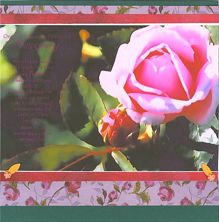
These assorted LOs were a result of several days of challenges at a yahoo group of which I am a member. I did not intend to make a specific album focusing on my spiritual side, but each of the pages I made just seemed to turn out that way! The album is 8x8.
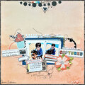
This challenge was to use our oldest paper/cardstock and our newest embellishment. Photo was altered and printed onto white cardstock. TFL :)
Does this project or one of it's images contain pornography, profanity, or other illegal or offensive material? If so, please report it and our moderators will come by and clean it up in a flash.
June 19, 2006
June 18, 2006
June 07, 2006
June 07, 2006
June 07, 2006
June 06, 2006
June 06, 2006
June 06, 2006