Storage & Organization up to 60% OFF!
Plus, a FREE Gift! | Details Here.
Plus, a FREE Gift! | Details Here.
 Give a Cheer
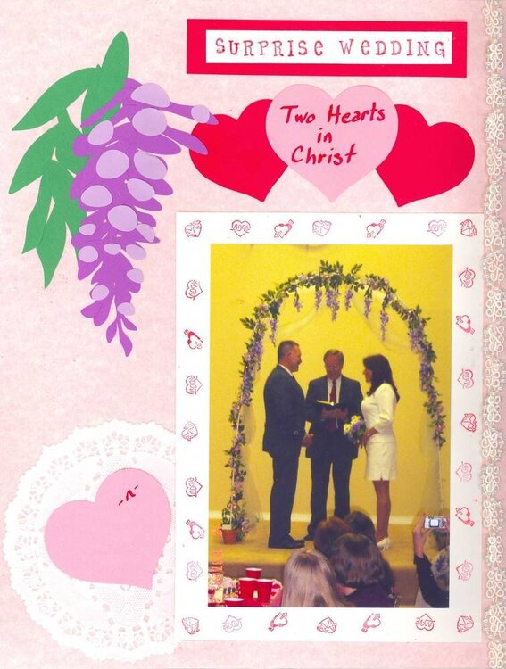
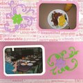
I really want this layout to be much nicer than what I normally do.
I like the right 2/3's of the layout. I can redo the whole thing. I'm not locked into this. It's the left third that has me stumped.
I've tried other things that I have but didn't like it. I did the wisteria to go with the wisteria in the photo. I would like to include the wisteria thru out the layouts for this wedding.
In the pink heart at the bottom, it has the names of the couple which I blanked out for upload.
1) what changes should I make to the wisteria?
2) what can I do with space between the wisteria and doily?
3) should I keep the doily and heart in the bottom?
4) what should I do with the left side?
Thanks, I appreciate any help/suggestion at all.
Okay, I've redone this page. Here's the link:
http://www.scrapbook.com/scrapbook_layouts/showphoto.php/photo/194663/cat/500/ppuser/45338
No products have been added to this project.

Thanks for spreading positivity!


December 23, 2006
March 09, 2006
March 09, 2006
March 09, 2006