You spelled friends wrong....KIDDING!!!!!! I love the colors you used. They seem to be out of your normal style, which I love, but like seeing you do other things also.
SHCG: So cool. I like the overall layout of the photos but would suggest inking them. As for the charm, what about using a brad and fishing line. You could let it dangle on it's own or use a glue dot to keep the charm from flipping all over the place. Love the Friends but agree with Marlene about moving them down just a bit so the full branch shows. I like the journaling area and the placement for the date and place. The fishing block is so cool. I like the ribbon in the area that you show it. Very fun LO, great response!
SHCG: Great colors on this! I love the owl stamp. Is the orange box for future journling? I like the ribbon where it is and maybe you could attach the charm to the ribbon.
SHCG:I love the owl, and the way u did the title! I think that the placement for the pics is great and would use the empty space in the orange box for journaling :)(just me)
SHCG: I love the owl paper you chose (of course LOL) and I think the placement of the photos is great! The letter S in friends is covering the tree branch, I would move it down so it doesn't cover (just me) . the space in the orange frame looks a little empty, i don't know if that's part of the paper or a separate pp, if so I would move it more to the left under the pics. if it's part of the paper I would maybe put some flowers there or something to fill in the space more. the ribbon I would put on the bottom of the page continuing the line from the bottom of the right side pp. for the charm you can put a piece of floss or some kind of thin thread and tie it onto the ribbon so that it hangs. hope this helps :)
SHCG: I think that you're off to a great start. My suggestion for the ribbon is to pleat it and add some brads or buttons to each pleat. I think that you can add the charm by stitching it onto the page...I've never used charms before! I think it would look really great if you added a few more embellies around the page, maybe like the frog that you already have. I also think that you should add some stamps or rub ons to your journaling block to add interest.
SHCG: I love this one! Great colors! Great pps, super fun title! I think everything is fine the way it is, or almost :)I love the owl and frog, but wish there was one more animal on the right page. Also, the border on the bottom left-if you can repeat it on the top right it will be awesome( in my eyes), or just 2/3 or 1/3 of the way. I like where the ribbon is-all I'll do to it is cut the end on an angle or arrow, so it kind of points to your fun pics.The picnic table charm-can you cut the loop? And then just glue it down where it is. Or get some white string and hang it from the holes on the journaling block. I sure hope all this makes sense to you! Very fun LO!
SHCG - You're off to a superb start, girlfriend! Way to take on this challenge. First off, could you please revise your post in the LO thread to note this is a BWC response, to help us tRAKkers? Thanks! I really like the overall placement to things on this 2-pager already. Excellent call to use multiple elements in that soft yet playful neutral palette. Fab whimsical embellies. I think the asterisk flower should go at the end of "fishing" as an asterisk in regular use would go. And I kind of LIKE the white backgrounds to the "fishing" letters, I think they make 'em stand out in a funky contrasty random way. I do think "friends" needs to stand out more as it's a bit subdued to me, maybe add some brown inking to the letters. I like the picnic table & suggest glue dots to affix it. I don't get an equal from the charm or from the arrows but I don't think you need one, the scenario is presented well anyway. I like the ribbon where it is. I also really like the scrolly border on the left page & would like to see it more, so I could see it continuing for 2/3rds more into the right page, OR perhaps having it go across the top right page? (just playin in my head here...). Anyway, I think this is more finished than you're giving yourself credit for & you should be proud of it! It looks like you had a lovely day outdoors w/ friends, & you convey your fun day in nature well in this LO.
Bren - I really like where this is going. Ribbon - I would adhere right there...line up with the bottom of that pic on the left and have it go across the two pages. I'm not sure if you meant with the stamps that where they are is where you're going to stamp them, but I think that would be better done in the journaling spot to the lower right (after you journal of course). I'm thinking, instead of the picnic table, which just seems out of place to me, what about 4 brads, one in each corner of the journaling block? Very nice photos and placement of them!
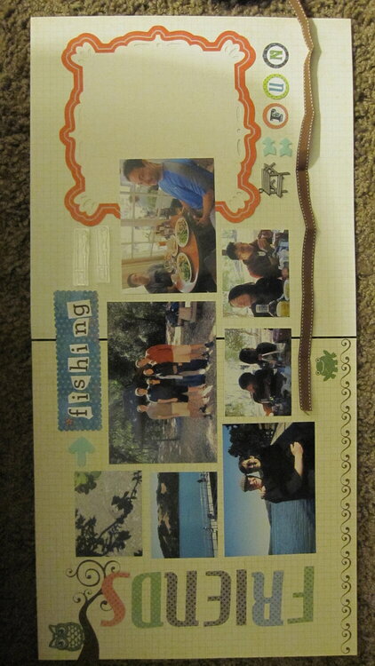
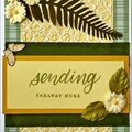
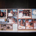
This is for the 2010 BWC #11: Everything But the Kitchen Sink (by Michelle aka ChellRae) which required us to use 3 sheets of cs, deco scissors, a ribbon, a flower, an arrow, metal, stamping, and a button.
3 sheets=2 bg pp and journaling die cut deco scissors=fishing mat ribbon=see bottom of spread flower=tiny flower shaped button doubling as asterisk next to fishing, journaling will explain this arrows=felt pieces at top and 2 at bottom in an attempt to represent an = sign metal=picnic bench charm didn't look enough like an = sign stamping=acrylic date and place TBA button=see notes on flower above
This was a tough one for me for two reasons. This page was unplanned and totally off the cuff; and I felt like I was forcing it trying to tie all these elements together.
To help make things easier, I mostly used pieces that came from the same kit. The arrows, polka dot pp, tiny flower button, acrylic stamps, metal charm, and ribbon are not from the same kit.
Under construction: The three pieces of cs have a light grid pattern that did not show up well in the picture. The letters in fishing will not have the white bg. To the right are acrylic stamps I will use with the date and place.
Critiques: Please refer to notes in description when making suggestions. I'd like feedback on photo placement and flow of the lo. I'm not sure how to adhere the charm. It was difficult to anchor because it looks tilted no matter how I place it. I'm also not sure how to treat the ribbon. Any other suggestions are welcome.
Does this project or one of it's images contain pornography, profanity, or other illegal or offensive material? If so, please report it and our moderators will come by and clean it up in a flash.
August 10, 2011
August 23, 2010
August 21, 2010
August 11, 2010
August 11, 2010
August 09, 2010
August 06, 2010
August 04, 2010
August 03, 2010
August 01, 2010
August 01, 2010
August 01, 2010