%20-%20Scrapbook.com)
Thank YOU! It's Customer Appreciation Week!
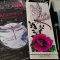
EXTRA 11% OFF Orders $100+ With Code: THANKYOU
EXTRA 11% OFF Orders $100+ With Code: THANKYOU

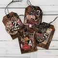
 Give a Cheer
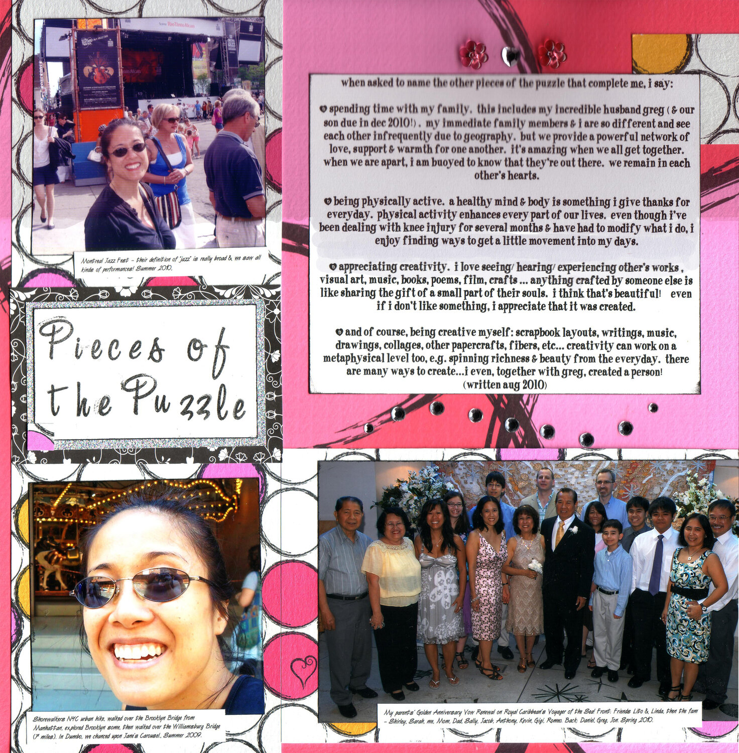
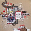
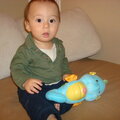
Here is my response to Tay/Scrapping Diva's "All About Me" Challenge to scrap about the non-scrappy things that are the other pieces of the puzzle that complete you, using primarily your fave color. I listed spending time w/ my family, getting physical activity, appreciating art & yeah I couldn't resist adding being creative to this LO too (it was too tough to exclude scrapping!).
Journaling: "When asked to name the other pieces of the puzzle that complete ME, I say:
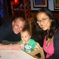
- Spending time with my FAMILY. This includes my incredible husband Greg (& our son due in Dec 2010!). My immediate family members & I are so different and see each other infrequently due to geography. But we provide a powerful network of love, support & warmth for one another. It's amazing when we all get together. When we are apart, I am buoyed to know that they're out there. We remain in each other's hearts.
- Being physically active. A healthy mind & body is something I give thanks for everyday. Physical activity enhances every part of our lives. Even though I've been dealing with knee injury for several months & have had to modify what I do, I enjoy finding ways to get a little movement into my days.
- Appreciating creativity. I love seeing/hearing/experiencing other's works , visual art, music, books, poems, film, crafts ... anything crafted by someone else is like sharing the gift of a small part of their souls. I think that's beautiful! Even if I don't like something, I appreciate that it was created.
- And of course, being creative myself: scrapbook layouts, writings, music, drawings, collages, other papercrafts, fibers, etc... Creativity can work on a metaphysical level too, e.g. spinning richness & beauty from the everyday. There are many ways to create...I even, together with Greg, created a PERSON! (written Aug 2010)"
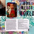
Photo captions:
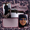
"Shorewalkers NYC urban hike, walked over the Brooklyn Bridge from Manhattan, explored Brooklyn some, then walked over the Williamsburg Bridge (7 miles). In Dumbo, we chanced upon Jane's Carousel., Summer 2009.
Montreal Jazz Fest their definition of jazz is really broad & we saw all kinds of performances! Summer 2010.
My parents' Golden Anniversary Vow Renewal on Royal Caribbean's Voyager of the Sea! Front: Friends Lito & Linda, then the fam Shirley, Sarah, me, Mom, Dad, Sally, Jacob, Anthony, Kevin, Gigi, Romeo. Back: Daniel, Greg, Jon. Spring 2010."
A big THANKS to Marlene - I was racking my brain trying to think of one "puzzle piece" for this challenge. But when I saw her fantastic response - http://www.scrapbook.com/galleries/152683/view/2812540/-1/20/1.html - I realized I could include a FEW things here! Much appreciation for the inspiration. And yep I guess we have similar fave colors!
As usual, my scanner crops off the side margins. The glitter cardstock title matte & the bling are more sparkly in person. And my little square punch (used near the title) died after this LO, I gotta add it to my wishlist. SHCG veterans, those pink flower brads were bought years ago to scrap the WIGU mini book... I was saving them for that project & never used them until now! Oh the top half scanned darker than the bottom half due to the dimension of those flower brads.
Thanks for a great challenge, Tay!
TFL :)

Thanks for spreading positivity!


October 29, 2010
September 23, 2010
September 18, 2010
September 14, 2010
September 14, 2010
September 11, 2010
September 07, 2010
September 02, 2010
September 02, 2010