Thank YOU! It's Customer Appreciation Week!
EXTRA 11% OFF Orders $100+ With Code: THANKYOU
EXTRA 11% OFF Orders $100+ With Code: THANKYOU

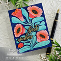
 Give a Cheer
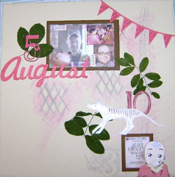
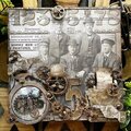
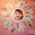
I was doing a lot of new things here. I wanted to try out me new Cricut cartridges (I used 3), I wanted to make a collage photo, and I wanted to use crayon. On my actual birthday I didn't take any pictures, so I chose the best photo of me and the friend I hung out with, David. Yes, that is the same photo as my pic on here. I also wanted everything to stay connected on the layout. The journaling (in the banner) is the list of things I did on my birthday: "Hung out with cats, Read a book, movie with David, Target with David, picked up Clayton, watched Bollywood DVD." Oh, and the animal is my horrible drawing of a Thylacine, which was the subject of the book I was reading that day.
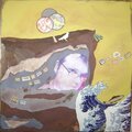
This is my Day in August challenge lo, but it's terribly late!! I started working on a different day and this one popped in my head.
No products have been added to this project.

Thanks for spreading positivity!


October 01, 2010
September 23, 2010
September 20, 2010
September 20, 2010
September 18, 2010
September 16, 2010
September 15, 2010
September 14, 2010
September 12, 2010
September 10, 2010
September 10, 2010
September 10, 2010
September 10, 2010