SHCG -Beautiful woman & photo! What a nice tribute to your mom & great addition to your book. Love the color scheme & swirly-ness, so elegant. Rockin overall placement of everything here. One thing I'd add is one more extra bit of black in the lower left, say the center of the big flower, to bring together the black bands on the left & bottom. But this is already pure loveliness as is!
SHCG: What a beautiful photo. I really love you layout, colors, and embellishments. This is a teenie tiny suggestion...I would use care with black embellishments. "Black" sometimes sends the wrong message.
SHCG: Love that you're using this beautiful photo! The pp and flowers give it a lovely vintage feel without being typical. I also like the old-school photo corners. I could see Jacqueline in a large, pretty, script font going vertically up the left side. Just a suggestion... I'd swap out the heavy black ribbon and use an off-white lace. It would add to the vintage feel and play off the lighter colors of her skin rather than the dark of her wrap. Very pretty LO you have here!
SHCG: love the photo and the colors you chose! the pic of your mom is beautiful :) i'm guessing that black stripe is ribbon, I would suggest continuing it to the end of the page on both sides and maybe adding a title "my mom" or something like that and you could even add a little poem about moms. :)
SHCG: Love those flowers and brads. Striking portrait of your mom. I definitely like the idea of adding a year. I was thinking that celebrating her different roles in life might be a good idea. Something like: Wife, Mom, Jacqueline, with her name in larger and contrasting font than the others and standing out above the first two. Also, not sure if it's the photo, but it seems the portrait needs to be straightened out a bit on your lo. I'm for breaking up the black ribbon, maybe with lighter colored rubon flourishes, cream colored maybe. Looking forward to the final outcome. ETA: I like the added elements.
SHCG: Thats really a stunning photograph. I think that the ribbon works because of the black and white photo as well as the little photo corners...you could add a tny thin strip of pp or ribbon over the black ribbon n that plum color to break the 'harshness that a few people have mentoned, but I think it works the way it is!
SHCG: Such a pretty picture and lady! I love the pp that you used here and the flowers! I think the ribbon is a bit darker and harsh-I'll go with brown. I think it looks great the way it is-if you add more embellies it may take away from the beautiful photo and now the big photo is the center of the lo-like it should be. I have a suggestion for the title and may be dates-you can put approximately how old she is in this photo, and I'll go with the name instead mom-I'll use white swirly letters, not too bit on the photo-lower part, between the flowers and the photo corner. Hope this makes sense. Beautiful lo!
Oh, absolutely use her name for posterity, maybe use 'my beautiful mom' then 'Jacqueline' in two lines next to it a little offset as you have the ribbon. Then I, and it is just me, would put her birthdate along the bottom if she is still with you, if not, then use a mark you like for a dash and add date of death. I would agree about the ribbon EXCEPT you have used the photo corners and her dress is so dark. Looks Great!
shcg - love that picture. I think you chose very well the pp colors to go with it. I feel like the ribbon is too dark - it looks black here and is distracting to my eye. I think a brown would work better (or maybe it is brown but just the photo of the LO is distorting that). Also the vertical ribbon is throwing me off. I like your idea for the title and for adding the year or approximate.
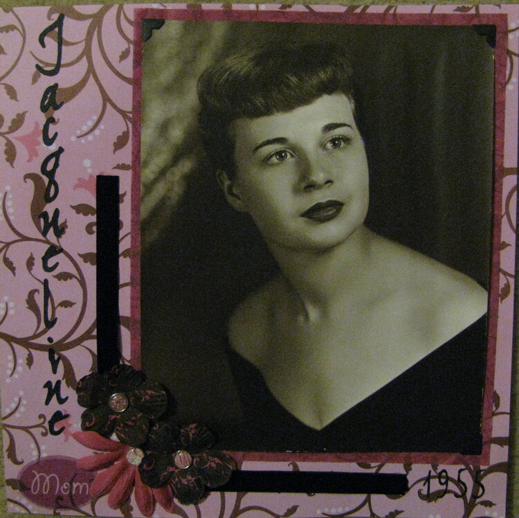
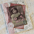
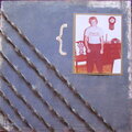
I don't know the year this photo was taken. It is a photo of my mother for my Heritage album. I need some suggestions on where to go with this LO. I want to add a title of maybe Mother or her name, Jacqueline. I don't know if I should add more embelies or leave it simplistic. Thanks for the suggestions, here is the revised. I tried to straighten out the photo but the paper mat is very delicate and it wasn't working...it will have to stay a bit off unless I figure out out to adjust it withouth ruining both the mat and the pp.
Does this project or one of it's images contain pornography, profanity, or other illegal or offensive material? If so, please report it and our moderators will come by and clean it up in a flash.
December 05, 2010
November 28, 2010
November 26, 2010
November 17, 2010
November 12, 2010
November 11, 2010
November 07, 2010
November 07, 2010
November 05, 2010
November 03, 2010
October 31, 2010