Storage & Organization up to 60% OFF!
Plus, a FREE Gift! | Details Here.
Plus, a FREE Gift! | Details Here.
Be the first to cheer this project!

 Give a Cheer
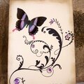
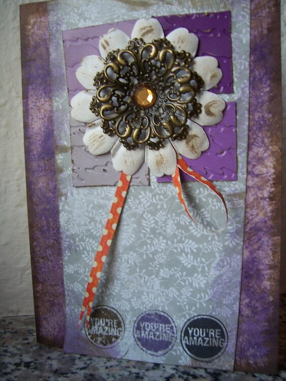
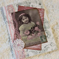
I wanted to use those purple squares and started by distressing the bg with purple and walnut stain distress ink. I absolutely don't like how it turned out. I imagined a soft, shaded, slightly distressed bg, but couldn't get it done. Now it looks harsh and rather like crackle paint. Don't know why, maybe I used to little moisture.
Actually the card looks better in the pic than in reality *g*
No products have been added to this project.

Thanks for spreading positivity!