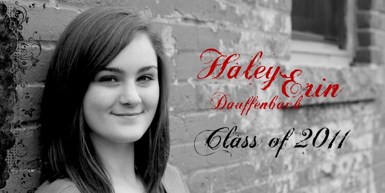
This one is my favorite. I like the size of her in this shot....not too up close. I love the edge brush. Maybe it's the grungy look again, it contrasts nicely with her sweetness. The font looks a fuzzy here again though. If it were me I'd make the Class of 2011 a little smaller and lower it. I like her name in red and how you placed it together. I might lower that group too...the last letters of the last name get lost in the window ledge shadow. Or, scootch it around enough so it's off the shadow.
Does this project or one of it's images contain pornography, profanity, or other illegal or offensive material? If so, please report it and our moderators will come by and clean it up in a flash.

 Give a Cheer


February 15, 2011