FREE Standard Shipping on Orders $69+ with code:
FREESHIPPING

Cheers
Give a Cheer

 Give a Cheer
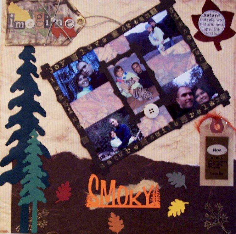
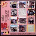
This trip me and scott went to the smokys. We had a great time. What i liked the most is that i hed the chance to feed a tiger!!!
No products have been added to this project.


Thanks for spreading positivity!


August 01, 2006
June 08, 2006