Storage & Organization up to 60% OFF!
Plus, a FREE Gift! | Details Here.
Plus, a FREE Gift! | Details Here.
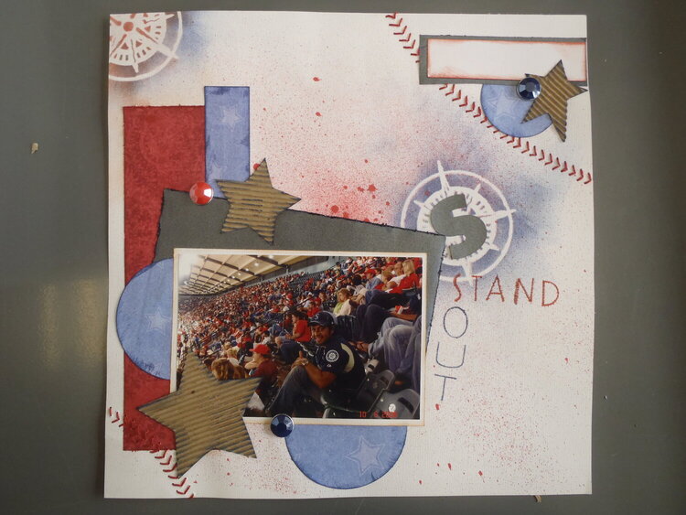

 Give a Cheer
I was loving this page until I tried to put a title on it - now I hate it! Help! How can I fix it???
No products have been added to this project.


Thanks for spreading positivity!


July 17, 2011
July 15, 2011
July 15, 2011
July 14, 2011
July 14, 2011
July 13, 2011
July 13, 2011
July 13, 2011
July 13, 2011
July 13, 2011
July 12, 2011
July 12, 2011
July 12, 2011