Having all those small photos at the top, with her in motion, gives us the sense of her playing actively, so I like that part. I wonder if reversing the two photos on the right with the one large one ont the left would be more pleasing, as it seems now that all the lower phtos are facing outward on the page. The colors are very good because they emphasize the cold snowy atmosphere, and her pretty clothes. As for the stickers, I think I would omit the pink and blue 'snowflakes' and put in more white snowflake stickers, with only a few on the pictures themselves, and the majority sort of floating in the air. The journaling looks well thought out, but I could not read it very well- which seems a common problem for those of us who put a lot into our journaling. It seems this forum does not make it possible to read many of the journals.
Having all those small photos at the top, with her in motion, give sus the sense of her playing actively, so I like that part. I wonder if reversing the two photos on the right with the one large one ont the left would be more pleasing, as it seems now that all the lower phtos are facing outward on the page. The colors are very good because they emphasize the cold snowy atmosphere, and her pretty clothes. As for the stickers, I think I would omit the pink and blue 'snowflakes' and put in more white snowflake stickers, with only a few on the pictures themselves, and the majority sort of floating in the air. The journaling looks well thought out, but I could not read it very well- which seems a common problem for those of us who put a lot into our journaling. It seems this forum does not make it possible to read many of the journals.
I agree that the photos on the right need to be grounded, and matting would be my first suggestion, but I really like Taba's idea of stamping a snowflake. I think that would add the subtle mat you need and the extra embellishing you feel is lacking on this part of the page.
Angie, this is awesome! I love your page! I also agree about adding matting to the 2 photos on the right and also add the snowflakes like Tara said. I love the way you matted the focal photo and the embellishments are perfect! ;)
Fabulous LO! I love the colours you chose! I agree with the above comments that the two lower pics on the right need a little something: matting? I love the edges of the BG paper! Such a great LO! TFS!
This is awesome!!! Love the photo strip, the colors, the handwritten journaling; all so cool! I agree that something needs to be added to the two pcs. I like the idea of a ginat snowflake, but maybe in a pinkish hue. This is definitely worthy of publishing; great work :)
Wow this is an awesome LO! I think it is beautiful, love the pink embellishments with the snowy theme. The embellishments look great, I do however agree with the previous posters that you should do something to the righthand pictures. That would tie everything in together perfectly! Great job!!
Wow! I really like this. :) Perfect color combo. I'm lovin the pic strip at the top, too. I agree that some form of mat would look nice under the two pics on the right. The torn paper looks terrific in this snowy theme. Congrats on a very non newbie looking lo!
I really like your layout. Love the pictures across the top! I think maybe another pink element on the right hand under the two overlapping photos would tie this layout together perfectly.
A newbie huh? No way. excellent use of technique. I love that paper. I agree that the left side looks a little less finished than the rest. But, You can acheive a more finished look without matting if you desire. You could stamp a huge snowflake centered under where the two photos meet. And if you have another one of the white snowflakes like the two on the left side I would add one above the two photos right beside your journaling to add focus and a finsihed look to that. Overall you have done an EXCELLENT Job. Love how you used the sketch! Really like the heart and the cute title. great pics. REALLY well done!!!!!
First off - you are doing awesome work! I love the photo strip across the top, and the whole left page. My only suggestions are for the right side - the two photos together? I think I'd mat them - they don't have the same 'finished' look as the rest of your LO. And above them (which might be sorted out by the matting thing, but I couldn't tell without seeing it IRL) seems a little 'bare' - do you have three smaller hearts or snowflakes? Just a little something above the photos for balance... But those are just suggestions, since you said you were thinking about submitting it? I really like the colors and your journaling, too.
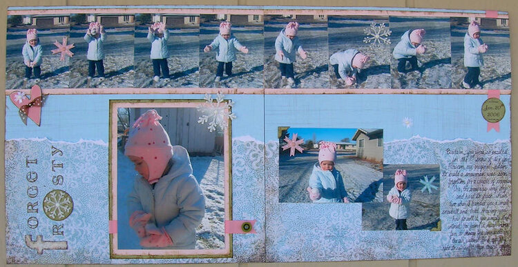
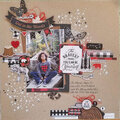
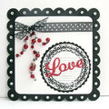
When I look at it IRL it seems like there are plenty of embelishments, but then when I look at it on the computer, it seems to lack something. What do you all think? Anything else you would do to it if it were your lo?
Does this project or one of it's images contain pornography, profanity, or other illegal or offensive material? If so, please report it and our moderators will come by and clean it up in a flash.
June 05, 2006
June 05, 2006
May 22, 2006
April 28, 2006
April 27, 2006
April 24, 2006
April 24, 2006
April 23, 2006
April 23, 2006
April 23, 2006
April 23, 2006
April 23, 2006
April 23, 2006
April 23, 2006
April 23, 2006
April 22, 2006