Storage & Organization up to 60% OFF!
Plus, a FREE Gift! | Details Here.
Plus, a FREE Gift! | Details Here.

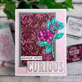
 Give a Cheer
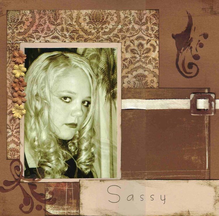
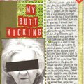
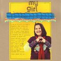
Another lo of Kristen at her Freshman Dance. Can you tell I made her pose for pics? I'm glad now that I did, even though the other parents were looking at me like I was a freak.
I'm not real happy with how this one turned out, something with the title I dont like. I might take it apart and redo it.
Products Used:
brown cs
Basic Grey Urban Couture (Rum Raisin and Brocade)
Heidi Swapp foam stamps
primas
cream twill ribbon
basic grey undressed chipboard hardware
brown craft paint
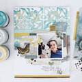
No products have been added to this project.

Thanks for spreading positivity!


April 28, 2008
July 06, 2006
July 03, 2006
May 18, 2006
May 04, 2006
May 03, 2006
April 29, 2006
April 29, 2006
April 29, 2006
April 28, 2006
April 28, 2006
April 27, 2006
April 26, 2006
April 26, 2006
April 26, 2006
April 26, 2006
April 26, 2006
April 25, 2006
April 25, 2006
April 25, 2006
April 25, 2006