Thank YOU! It's Customer Appreciation Week!
EXTRA 11% OFF Orders $100+ With Code: THANKYOU
EXTRA 11% OFF Orders $100+ With Code: THANKYOU
Be the first to cheer this project!

 Give a Cheer
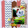
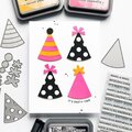
Have you ever associated colors with genders? Is pink definitely girl? Is blue always boy? Hopefully after this post you can see how colors are gender neutral. It's how you use them that makes them feminine or masculine. With just a few accessories or shapes you can change the look of your project to suit your story.
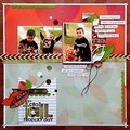
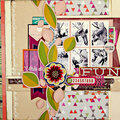
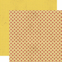
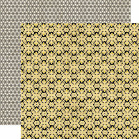
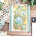
In both my projects i used the same color palette & patterned papers: Happily Lost Villa, This & That Brooch, and This & That Teacup. Basically Orange, yellow, black, grey, & blue. Sounds pretty masculine too me.
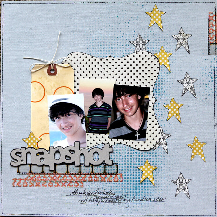
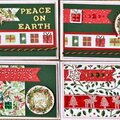
I did start with a masculine page. I picked some colors that i thought would go with the feel of his photos. I wasn't basing the colors on gender but what went with these photos. In fact if you look at the names of the paper, they seem to say feminine: teapot, brooch. I sprayed the background with blue mists in a grid pattern. The grungy grid reminds me of him. I decide to die-cut some stars out of the yellow & black paper. With a bit of black pen around the edges, they stood out on the background. A paper edge punch reminds me of school & notebooks so it was a good fit for this layout. Keeping it simple also seem the way to go to keep it in that boy feel i was looking to achieve. So love this layout, it is perfect for him!

Thanks for spreading positivity!