Card Making up to 60% OFF
Plus, a FREE Gift! | Details Here.
Plus, a FREE Gift! | Details Here.

 Give a Cheer
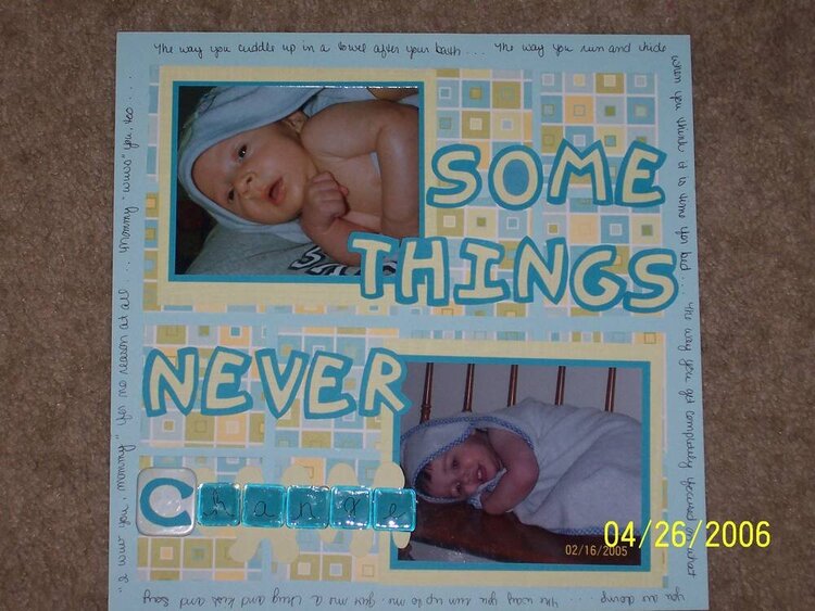
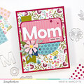
I fixed the O in Some and added some matting under change...as well as moving the title down and over a bit.
No products have been added to this project.

Thanks for spreading positivity!


May 01, 2006
April 30, 2006
April 29, 2006
April 28, 2006
April 28, 2006
April 28, 2006
April 28, 2006
April 27, 2006