
Happy National Scrapbook Day!
Extra 10% OFF Select Scrapbooking Brands with Code: NSD24
Extra 10% OFF Select Scrapbooking Brands with Code: NSD24

 Give a Cheer
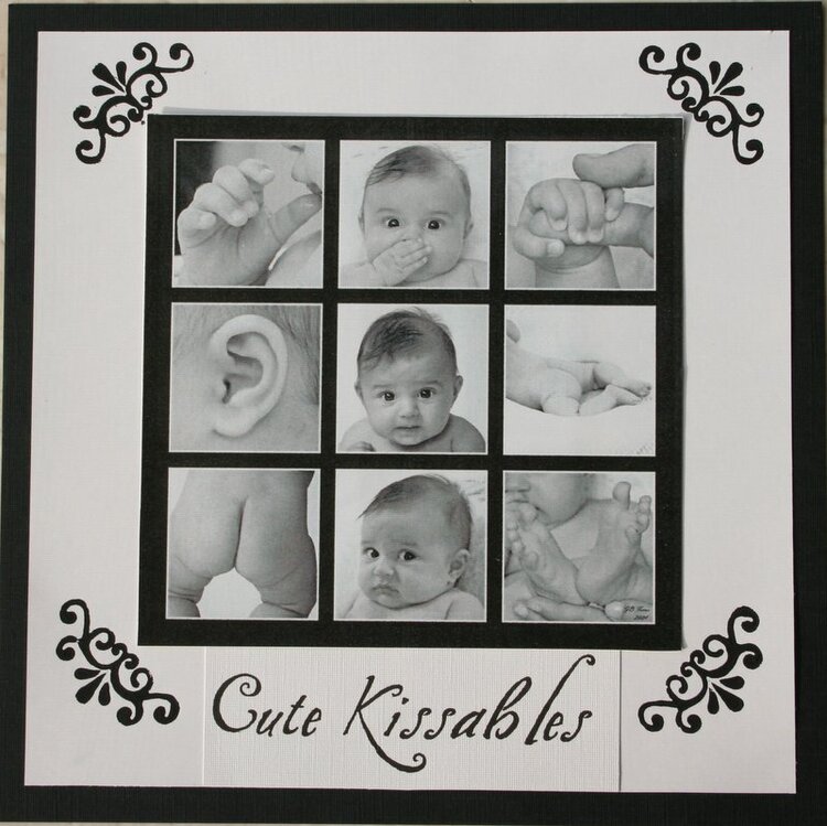
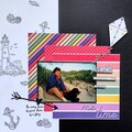
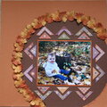
this is a layout I did of some pictures of my daughter when she was just three months old.
No products have been added to this project.
Thanks for spreading positivity!


February 12, 2008
October 29, 2007
October 29, 2007
August 07, 2007
April 14, 2007
April 14, 2007
April 14, 2007
April 14, 2007
April 13, 2007
April 13, 2007
May 09, 2006
May 08, 2006
May 07, 2006
May 07, 2006
May 07, 2006
May 07, 2006
May 07, 2006