
Happy National Scrapbook Day!
Extra 10% OFF Select Scrapbooking Brands with Code: NSD24
Extra 10% OFF Select Scrapbooking Brands with Code: NSD24

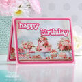
 Give a Cheer
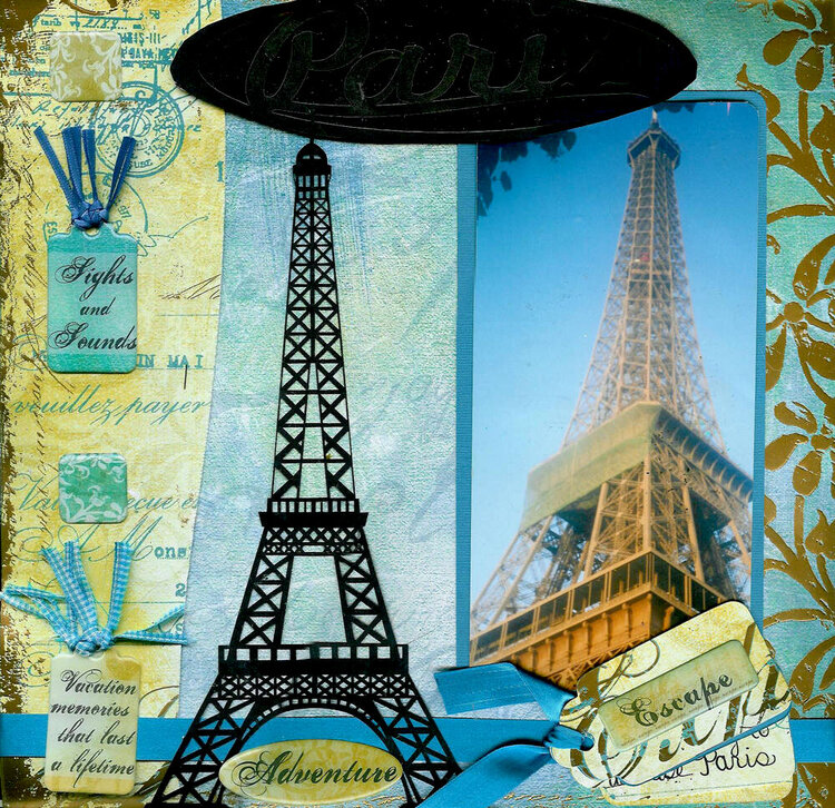
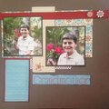
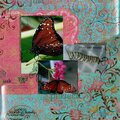
Another layout for amazing scrapper race. We had to make a poster like page of our dream destination! My partner and I choose Paris!
No products have been added to this project.
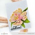
Thanks for spreading positivity!


June 05, 2006
May 20, 2006
May 16, 2006
May 10, 2006
May 09, 2006
May 09, 2006
May 09, 2006
May 09, 2006
May 08, 2006
May 08, 2006