FREE Standard Shipping on Orders $69+ with code:
FREESHIPPING

Cheers
Give a Cheer

 Give a Cheer
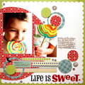
This was my May Luric Challenge entry. I worked on it for a week and I still don't like it. I might redo it entirely....argh! I think the page is a bit busy and I wanted the photo to stand out a bit more. I am thinking of redoing it on cream cardstock with really minimal patterned paper behind.
I took this picture of my DD in our backyard last week.
Lyrics Read:
"You don't need direction, you know which way to go
And I don't want to hold you back, I just want to watch you grow
You're the one who taught me you don't have to look behind
Oh yes, sweet darling
So glad you are a child of mine."
No products have been added to this project.


Thanks for spreading positivity!


March 12, 2008
July 13, 2007
July 13, 2007
May 31, 2006
May 27, 2006
May 25, 2006
May 22, 2006
May 16, 2006
May 16, 2006
May 11, 2006
May 10, 2006
May 10, 2006
May 10, 2006
May 09, 2006
May 09, 2006
May 09, 2006
May 09, 2006