FREE Standard Shipping on Orders $69+ with code:
FREESHIPPING

Cheers
Give a Cheer

 Give a Cheer
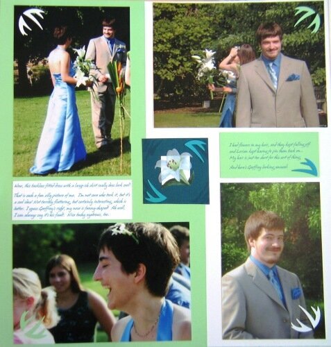
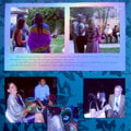
OK, I changed the photo to the version with lots of embellies - let me know which ones you think I should keep and which ones are too much (or whether I should have any at all).
I could also have four instead of just two in the corners around the center flower.
Also, now that I look at it, I think the white journaling block actually IS brighter white than the background! No wonder it annoyed me. So maybe just changing it to non-textured and not quite so bright white paper would help.
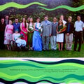
Also, the top-right photo is a temporary inkjet print, that's why it looks strange - I'll order a real print, slightly smaller size to match the rest, and replace it.
No products have been added to this project.
Thanks for spreading positivity!


May 17, 2006
May 16, 2006
May 15, 2006
May 14, 2006
May 14, 2006
May 14, 2006
May 14, 2006
May 14, 2006