
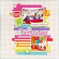
Cheers
Give a Cheer

 Give a Cheer
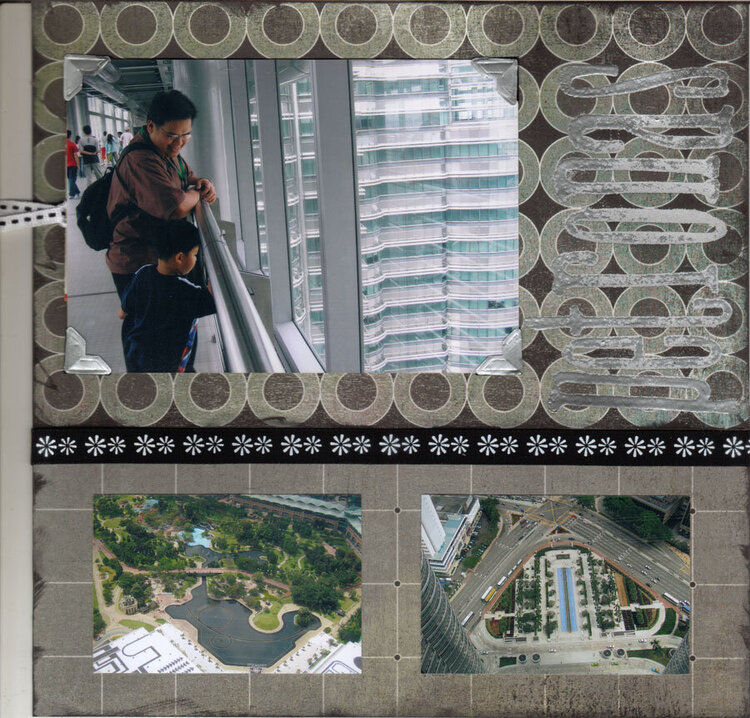
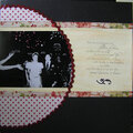
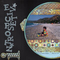
The tallest twin towers in the world- Petronas, Malaysia. There are tickets at the back of the photo.
Products:
BG Black tie
silver photo corners
versamark
silver embossing powder-Ranger
Scrapworks tailored ribbon
Tim Holtz black soot ink pad
No products have been added to this project.

Thanks for spreading positivity!


July 11, 2006
June 19, 2006
June 07, 2006
June 02, 2006
May 31, 2006
May 31, 2006
May 30, 2006