

Thank YOU! It's Customer Appreciation Week!
EXTRA 11% OFF Orders $100+ With Code: THANKYOU
EXTRA 11% OFF Orders $100+ With Code: THANKYOU


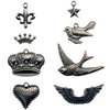

 Give a Cheer
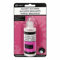
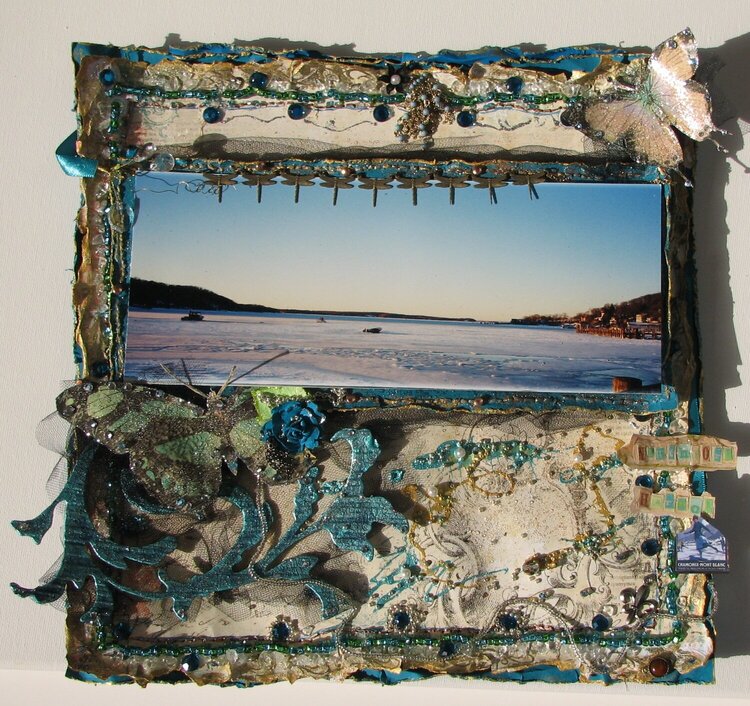
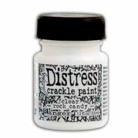
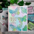
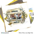
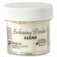
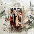
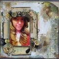
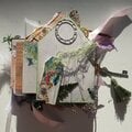
My Mother-in-Law took this photo. I posted this again because the sun came out stronger than before. The blue and green glass beads on the edge were first sewn on in groups of five, then glued in case the one thread holding it together broke. Even though with most of them i did another stitch. then i put masking tape on the thread on the back of the paper. Unfortunately it covered the area where i wanted to put metallic thread. I thought, it shouldnt be too bad. I put all the holes in with an embroidery needle. Then tried to sew. I wound up peeling off half the tape and it was all a sticky mess. Took an hour and a half to sew the thread on ,since its metallic , it got caught on everything. So, i hope i remember not to repeat the mistake. I did lose some time glueing stuff down , but had forgotten to put that chip scroll on first. Lost an h in the title, didnt realize that till i stood up and noticed it on the chair. A fun part here, ok , different, is i poured a little paint on in the middle. My nod to Jackson Pollock, lol, just kidding. I put the woman ice skating on in the lower right to put a human on the page, but theres no ice skating here. Its not safe to on salt water. I could talk about more mistakes i made here but ive already written more than people probly want to hear,hahah. Let me know if you want to hear . A couple of people want to hear about techniques. One of my favorite things is using clear embossing powder. Thats what makes the butterflies look like they have drops of water on them. Use a versamark ink pad, stamp the page, pour on powder, get rid of excess, then heat. For chipboard, i really am still experimenting with crackle. I used a Tim Holtz scroll here. Ive had better luck with cheap stuff from Michaels. I thought maybe cuz the surface looks more absorbent. So i used glossy accents, then gesso, then a teal paint, then gold,then aquamarine,then crackle. The last two paints were brushed on lightly. If you go to Scraps of Darkness to tutorials Rachibabe has one on using crackle. I was disappointed when i used versamark then embossing powder on the teal ppr under the photo. It looked like it was stained with grease. And ide already cut it from the one shade of ppr i wanted,had to make do with what i had. I had some pretty blue stitching around the piece under the photo, once i embossed it it didnt look as good so i brushed gold paint over the stitching. With the beads on the borders, i talk about them further up here, after i was done stitching then glueing, i added more beads with just glue to fill it out. Oh and to make crackle show more ive heard apply brown ink with a pad, then wipe it off, and whats left is in the cracks. I think it dulls the surface a little. I didnt do that on this one. And when you put crackle on, ive also heard dont go back and forth with the brush. I try to put it on pretty thick.About as thick as a coin,if not more. What i meant earlier is that the Tim Holtz surface looks more absorbent that the Michaels,so i tried to seal it with glossy accents. I forgot to say this but i put on glossy accents on the butterflies , let dry, then put on the embossing powder. I used layers of paints on the chip because i didnt like the thin layer of gold over the teal, so i brushed on the pale teal. There is folded up white tulle under the photo to give more dimension.I used masking tape and pop dots doubled to secure it. Youre not sposed to use masking tape. I folded up wide white ribbon to make teal under photo stick out, also put on with masking tape. I glue black tulle around with glossy accents. I had to rip the outside edges of the top sheet cuz it covered the piece under it, you couldnt see the teal. That was kindof disappoining at first cuz ide distressed it all and stamped with a very small stamp of a scroll, then embossed with gold. It turned out ok though.

Thanks for spreading positivity!


November 02, 2012
October 27, 2012
October 27, 2012
October 27, 2012
October 25, 2012
October 25, 2012
October 24, 2012
October 22, 2012
October 21, 2012
October 20, 2012
October 19, 2012
October 19, 2012
October 18, 2012
October 18, 2012
October 18, 2012
October 18, 2012
October 18, 2012
October 18, 2012
October 18, 2012
October 18, 2012
October 17, 2012
October 17, 2012
October 16, 2012
October 16, 2012
October 15, 2012
October 15, 2012
October 15, 2012
October 15, 2012
October 15, 2012
October 15, 2012
October 15, 2012
October 15, 2012
October 15, 2012
October 14, 2012
October 14, 2012
October 14, 2012
October 14, 2012
October 14, 2012
October 14, 2012
October 14, 2012
October 14, 2012
October 14, 2012
October 14, 2012
October 14, 2012
October 14, 2012
October 14, 2012
October 14, 2012
October 14, 2012