
Happy National Scrapbook Day!
Extra 10% OFF Select Scrapbooking Brands with Code: NSD24
Extra 10% OFF Select Scrapbooking Brands with Code: NSD24

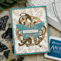
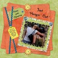
 Give a Cheer
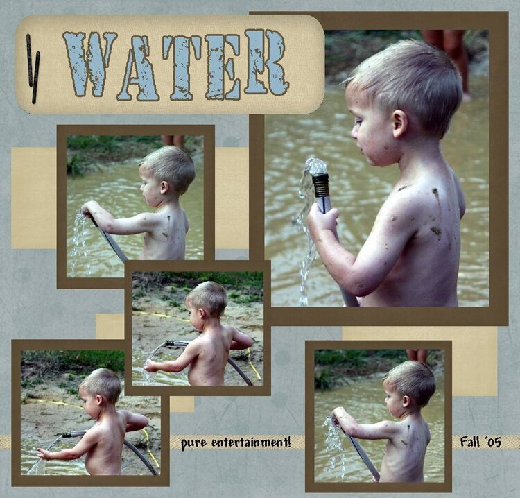
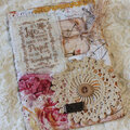
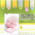
This was done for the keyword challenge. You know kids and water.
The program I use is CKSD. The kit was a free one from DIGICHICK - my friends.
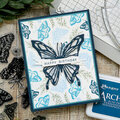
No products have been added to this project.
Thanks for spreading positivity!


June 28, 2006
June 25, 2006
June 24, 2006
June 23, 2006
June 20, 2006
June 20, 2006
June 16, 2006
June 16, 2006
June 14, 2006
June 13, 2006
June 11, 2006
June 09, 2006
June 08, 2006
June 04, 2006
June 03, 2006
June 03, 2006
June 03, 2006
June 01, 2006
June 01, 2006
June 01, 2006
June 01, 2006
June 01, 2006
June 01, 2006
June 01, 2006
June 01, 2006