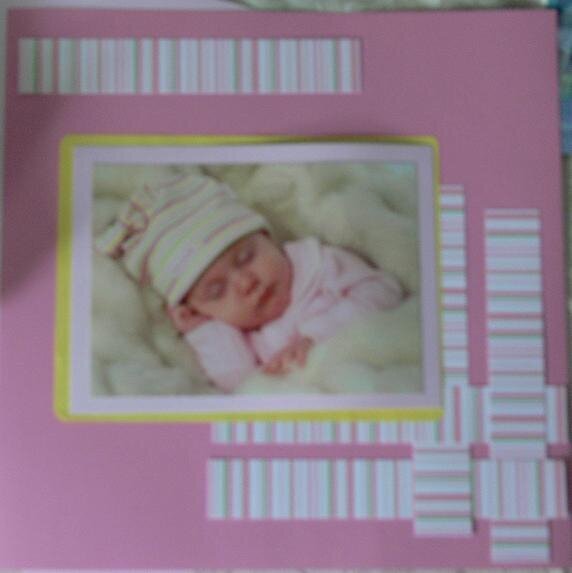
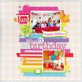
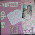
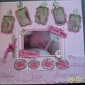
Maybe soften the yellow mat with chalk or even a piece of vellum.
Also I would add a title to the top striped strip.
Other than that - nice layout - precious baby!
as soon as i seen it i thought the striped weaved papers are great but i think another color would be better than the yellow it looks too bright or something a soft pink or ecru would look so much better
I think this is really sweet. It takes practice practice practice to make lo's look good IRL, then look just as good in the gallery! I'm finding that out!!! Play with the yellow a bit...I guess it depends on the look you are going for. The yellow now adds a fun splash!!
Oh what a precious baby. I agree I would drop the yellow mat and go with a green that is in the striped paper or a more pastel yellow like what is in the cap.
I like the layout...but I agree on the yellow comment above. I think the value is too intense for the pinks and yellows. I think a spfter yellow would get you that extra contrast....try for the color in the cap. BTW....what a precious baby!
Does the yellow match the hat?? It looks neon....so from what I can tell, I would lose the yellow. Maybe add an embellshment in the upper right or bottom left......buttons/metal plaque.....
I like it. It's quaint, I guess is maybe the word I'm looking for?? Not overdramatic and it's lovely. Too bad the pic isn't clearer, made me rub my eyes a few times...hehehe....but I like the pink and yellow. It's a keeper. I skimmed across your others and they are really good.
Does this project or one of it's images contain pornography, profanity, or other illegal or offensive material? If so, please report it and our moderators will come by and clean it up in a flash.


 Give a Cheer


September 16, 2006
June 09, 2006
June 09, 2006
June 09, 2006
June 09, 2006
June 09, 2006
June 09, 2006
June 09, 2006
June 09, 2006
June 09, 2006
June 09, 2006
June 09, 2006
June 09, 2006
June 09, 2006
June 09, 2006
June 09, 2006
June 09, 2006