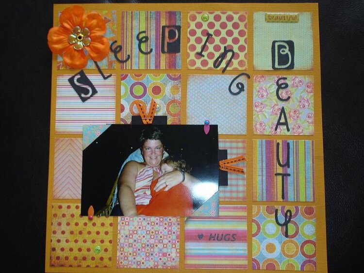
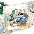
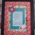
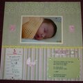
Diggin' on the squares big time! I did a lo like that recently (only nine squares) so I appreciate how tough it is to get them all to coordinate and not take focus from the photo... GREAT JOB with that!
Oh I love the look of this. The squares are awesome. It gives it almost a quilted feel. I love the font for the title. The colors are great, so many different pp's that work so well together. Super Job!
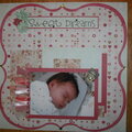
Ahhh.. Basic Grey my favorite! I love the paper and layout design, I think if you brought your picture up a little more towards the top of the page to draw the eye first to the adorable picture than to the title and have that pretty flower snuggle up against the side of the picture it would draw the eye to the picture. Your color scheme is awesome great job.
I like the look of the squares in the background - you did a nice job of combining all these bright papers in a way that pleases the eye. And complements the photo! The font for your title is very feminine - that's appropriate! :) It might be the scan, but to my eyes, the curve of SLEEPING looks a little off. I can't think of anything else I'd change... :)
Does this project or one of it's images contain pornography, profanity, or other illegal or offensive material? If so, please report it and our moderators will come by and clean it up in a flash.


 Give a Cheer


June 22, 2006
June 22, 2006
June 21, 2006
June 17, 2006
June 16, 2006
June 16, 2006
June 16, 2006
June 16, 2006
June 16, 2006
June 16, 2006