Ok..it seems as if there were some great suggestions already given so I am just going to say I know nothing about digi-scrappin' but I think this LO is great!!
There is one thing that just sticks out to me and that's the flowers at the bottom..What if you just kept the lime colored on and put it to the right a little more and deleted the other blue ones, with the papers being bright and busy, the flowers just make my eye go crazy and they take away focus from that great picture!! What an honor for Leah to be the Ambassador that's a great accomplishment for a young lady!!
I love the brush filter -- it totally works on this one, especially with the main picture of Leah in focus. It's a great way to add a new spin on some kind of traditional school pictures. I have only been digi scrapping for about 10 minutes and my software is very limited, so I don't know how difficult it is to modify the colors of some of your elements. I agree with Angie about the green color under the journaling not matching the rest of the LO, and I think the green in the flowers might be better if it matched a little more as well. But overall, fantastic page! You must be so proud of Leah!
Looks like you've edited this as I cant find the mats the others mentioned too! I love the pic of Leah! I have the same comment tho about the cropping (Leah looks a bit on the long side) or maybe it's just my eyes! Anyway, I love the photo effects too!
I really like the colors of this! It's bright and colorful, just like the photos which are great with the filter you've chosen. Have you updated this since the first couple of comments were made? I can't seem to find the specific areas they pointed out.
What an honor for her! I really love how you altered the 3 pics and left the main pic in good, full focus, and the "grade 5". I also like the texture of the purple cs mat. I agree that a small mat around the main pic would help set it off a bit. I also have a few other suggestions. I would alter the font color, and maybe even the font. It is quite difficult to read - especially "likes to show it off." The hues of green in the striped pp don't go too well with the greens in the rest of the lo. By no means am I a color expert, but it seems to me that the greens in the pp have more blue in them, and the greens in the rest of the lo have a lot more yellow in them. Can you alter the colors for the pp, or is that the only color you have to choose from? Very fun lo!
Very cool lo!! Love all the different photo effects. You might want to outline the oval pic in one of the shades of purple just to show that pic off more. Love the way you did the title and the journaling too :)
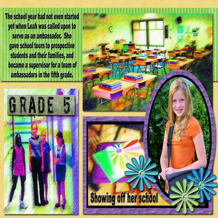
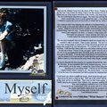
*** Ambassador in 5th grade *** The school year had not even started yet when Leah was called upon to serve as an ambassodor. She gave school tours to prospective students and their families, and became a supervisor for a team of ambassadors in the fifth grade. *** Showing off her school. *** *** Digital layout made with PSE2 and Cottage Arts digital Elements.
Does this project or one of it's images contain pornography, profanity, or other illegal or offensive material? If so, please report it and our moderators will come by and clean it up in a flash.
June 20, 2006
June 19, 2006
June 18, 2006
June 18, 2006
June 18, 2006
June 18, 2006
June 17, 2006
June 17, 2006
June 16, 2006