What a great layout and whoever you give this to will be very happy to receive it. I think the letters you made are great and wouldn't have known they weren't part of the set if you hadn't told us. I agree with momofmeg that I had trouble with the title and figuring out who they were. So a line or two below the photo wouldn't hurt. Or...and this might be a stretch..but could you add a hidden journaling box on which the gift recipient (sp??) could add their own thoughts about the event?? I can't wait to see more of the pages you make for this album.
I think this is great... I love the layering and the all over stamps. I really like the variation of your two white letters -- what a clever response to a supply problem! I don't find the space right under the photo to be bare at all, but that's just one puppy's opinion. The only thing that made me think (and this is because I'm a stranger, and I know the people receiving your gift book will know) is to wonder which are Quinn and Bryan when there are 5 people pictured in the photo (I assume it's the guys, not the kids). Would you consider adding a couple of handwritten lines under the photo giving the date, the names of everyone in the photo, and maybe the occasion on which the photo was taken? Fifty years from now the grandkids might really appreciate having that information. I've spent some time recently with my extended family watching them try to decode who was pictured in some old photos and sometimes it's a struggle -- and the generation that knows the answers is now 70. Thanks for sharing!
I think you should love this lo! I sure do. I love how you layered the paper, and how some corners are rounded and some square. I think the thin mat around the pic helps it stand out too. I really like how you did one flower stamp on the pp by th pic - it really unifies the lo, and great idea to add the jeweled brad in the center of that specific flower. Your adapted letters look great! They fit wonderfully, especially since you have one in both names. Hmm... I normally have at least one suggestion, but I honestly don't see anything I would change or add. AWESOME JOB!!
I love the y and n! I think that was a clever move! We definitely get challenged when we're lacking some embellies and I think you did great! I love the paper layering, the rounded corners on some sides, the brads too and the brad you placed on one flower. This looks awesome!
I don't think you need to worry about the white letters being too bright. You found a clever solution to the missing letters, and I would not even have noticed that they did not match if you did not mention it. I like the purple flower stamp, the polka dot and striped papers, and how they bring the attention inward toward the one photo. You have 4 brads, with one centered in a purple flower, which is clever, and I like the pattern of the 3 brads in a row. The striped paper around the photo echos the vertical lines of the doorway in the photo.
LOL leave it to Leanne to find that!! I love the colors you chose and the flower stamping too! But I have to say I agree that maybe a little piece of the flower could be stamped to where maybe it's coming out from under the pic..that would distract from the space, even if you don't add/change anything this LO is great as is! :) :)
Love the papers and flower stamps! I think the y and n look great. I only see one tiny tiny thing I'd do. It's so small I'm embarrassed to even mention it, but you sound like you might be a perfectionist like me. ;) Directly above the blue circle in the letter y I would stamp a small peice of a flower coming down a tad from under the pic. It seems a little bit bare, but I'm probably the *only one in the world* who would think so. :) This is beautiful, and I am rediculous!!! :)
I think the y and n look just right! They would have been too bright just white but with those rubons, they don't jump out to me too much at all. I love how you stamped that flower all over, it really unifies the whole page. I'm not very good at coming up with suggestions for change, but I think this layout is just right! Love it!
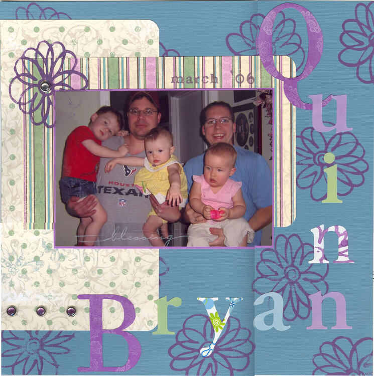
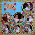
Any ideas? This is the first layout for my gift album series. I didn't have enough letters for the "y" and the "n", so I used white letters and applied rubons and stamps to tone it down a bit. The white seemed too bright against the more muted colors. Did I meet my objective? I'm not quite happy with it.
Does this project or one of it's images contain pornography, profanity, or other illegal or offensive material? If so, please report it and our moderators will come by and clean it up in a flash.
June 20, 2006
June 19, 2006
June 19, 2006
June 19, 2006
June 19, 2006
June 18, 2006
June 18, 2006
June 18, 2006
June 18, 2006
June 18, 2006
June 17, 2006
June 17, 2006
June 17, 2006