

Thank YOU! It's Customer Appreciation Week!
EXTRA 11% OFF Orders $100+ With Code: THANKYOU
EXTRA 11% OFF Orders $100+ With Code: THANKYOU


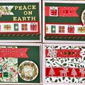
 Give a Cheer
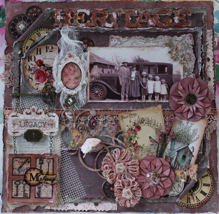
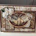
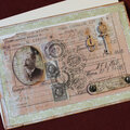
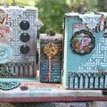
Here is my very first heritage layout! I do believe I put more work into it than any layout I've made thus far and I had a lot of fun doing it! I did a lot of prep on it before putting it all together. It seemed to take me forever to choose my papers
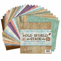
I'd originally started out with some totally different. Then I decided to go through one more box of my loose papers and found these that I liked much better! With the exception of the newsprint paper, all those I chose were given to me by my best friend. She got them from Costco several years ago. They are heavy double-sided cardstock.
History of the photo: Last summer we went to California to see family and we stopped off in Sacramento to visit my aunt. I told her and my cousin that I didn't have any pictures of my mom when she was little. My cousin said they did so he went a got a few out and this was one of them. I nearly cried when I saw it, it was in such good shape. He said he would email copies to me. I had forgotten all about them until the first of this month he sent me 8 pictures, most of which I hadn't seen before. I wanted to use this one for my first heritage layout. It is my grandfather and grandmother (we called them Poppy and Grandma), my three aunts and my mom. My mom is the 2nd from the right. I'm sure my grandma made their dresses and hats. It was taken around 1931 at Oklahoma City where they went to church.
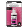
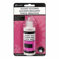
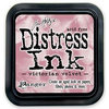
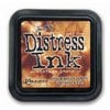
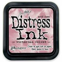
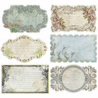
So first, I cut the title Heritage on my Cricut with the Reminisce Accents cartridge from Creative Memories, and the nameplate is from the Potpourri Basket cartridge. The material I used was from fruit snack boxes. (I save all that kind of stuff instead of purchasing chipboard.) I decided to try embossing them using Jennifer Snyder's technique of painting them with white acrylic and while still wet, sprinkling the embossing powder on and then using the heat gun. It worked great! I used Hampton Art a la mode and Stampendous Shabby Pink embossing powders. When they cooled I rubbed Tim Holtz Victorian Velvet and Vintage Photo distress inks over them to match the color scheme a bit closer. The scrap pieces on the right side and bottom were actually a thin matboard packaging material that came in something my son ordered! They folded up into triangle shapes so I saved one and embossed it with the Shabby Pink powder. I thought it turned out pretty cool. I cut it in half lengthwise to tuck under the edges of my second layer. I also embossed the elegant oval clay frame that I got from Angelica's LittleScrapShop on Etsy.com. The beautiful butterflies also came from her shop. I cut out the roses paper from DCWV's The Primrose Stack. I can't for the life of me believe this site doesn't have it for sale. It has the most beautiful collection of papers in it. I coated it with Glossy Accents and when it dried I cut a piece of wire, shaped it and framed it inside the frame.
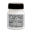
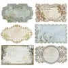
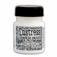
Next, I distressed the edges of pretty much everything and inked them with the TH distress inks mentioned above. Also did a little paper rolling and folding. All of the tags and clocks (with the exception of the clock tucked under the lower right flower were printables I got from Pinterest. The little key squares I glued to a Signature sample paint card that is brushed pearl in Sedona Frost. I used Tim Holtz Clear Rock Candy crackle paint on it. A piece of advice when applying, if it starts to curl up your paper like it did mine, try weighing the edges down, otherwise when it dries, if you're not careful and try to flatten it out it will chip off taking the graphic with it! It took a little piece out of one of the keys on mine so I tried to touch it up a bit and then used Glossy Accents over all.
I had so many elements I wanted to use on this layout but ran out of room. Fortunately, I was able to use all of my favorites.
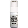
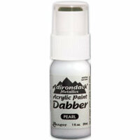
I made the twine (tutorial from Tracey Sabella) and paper flowers (tutorial from scrap-a-little.com's Helen Croft) as well as the beaded twigs. On the wood flourish I inked it with TH as above and then used Ranger pearl dabber here and there. I also inked in the lace I purchased at Walmart as it was stark white and I wanted it to match the color scheme. The ribbon on the lace is a specialty piece I picked up at a locally owned store called Pickled Papers. It is a fine metal that you can stretch out and it so awesome.
On this layout, I would like to personally thank the following ladies for their wonderful and creative inspiration: Gabrielle Pollacco, Rachelle Sigurdsen, Jennifer Snyder, Renea Harrison and Marilyn Rivera, to name a few. I can't believe how far my layouts have come since I first started, thanks to artists such as these ladies!
Thank you all so much for your wonderful comments and friendship! Have yourself an awesome and creative day!
Products used by not listed on this site:
Reminisce Accents Cricut cartridge
Potpourri Basket Cricut cartridge
Stampendous Shabby Pink embossing powder
Hampton Art a la mode embossing powder
White acrylic paint
DCWV The Primrose Stack
Paper Studio Gemstones (flower center)
Colorbok Vintage Treasures designer paper (newsprint)
Alene's turbo tacky glue
Spare Parts gears
Heart jewel, key and lock from Hobby Lobby
Pearl and gold button from Joann's

Thanks for spreading positivity!


April 28, 2021
April 28, 2021
August 03, 2017
April 26, 2017
April 26, 2017
March 06, 2017
February 17, 2016
February 17, 2016
February 17, 2016
February 17, 2016
February 17, 2016
February 17, 2016
February 17, 2016
November 27, 2015
November 27, 2015
February 05, 2015
January 18, 2015
January 16, 2015
January 14, 2015
January 13, 2015
January 13, 2015
January 13, 2015
January 11, 2015
January 10, 2015
January 10, 2015
January 10, 2015
July 15, 2014
July 04, 2014
June 28, 2014
June 28, 2014
March 24, 2014
March 14, 2014
March 05, 2014
March 05, 2014
March 03, 2014
February 19, 2014
February 18, 2014
February 18, 2014
February 18, 2014
February 18, 2014
February 18, 2014
February 18, 2014
February 17, 2014
February 17, 2014
February 14, 2014
February 10, 2014
February 09, 2014
February 08, 2014
February 07, 2014
February 04, 2014
February 04, 2014
February 04, 2014
February 04, 2014
February 04, 2014
February 04, 2014
February 03, 2014
February 03, 2014
February 02, 2014
February 01, 2014
February 01, 2014
February 01, 2014
February 01, 2014
January 31, 2014
January 31, 2014
January 31, 2014
January 30, 2014
January 30, 2014
January 30, 2014
January 29, 2014
January 29, 2014
January 29, 2014
January 29, 2014
January 29, 2014
January 28, 2014
January 28, 2014
January 27, 2014
January 27, 2014
January 27, 2014
January 27, 2014
January 27, 2014
January 27, 2014
January 27, 2014
January 27, 2014
January 27, 2014
January 27, 2014
January 27, 2014
January 27, 2014
January 27, 2014
January 27, 2014
January 27, 2014
January 26, 2014
January 26, 2014
January 26, 2014
January 26, 2014
January 26, 2014
January 26, 2014
January 26, 2014
January 26, 2014
January 25, 2014
January 25, 2014