
Cheers
Give a Cheer

 Give a Cheer
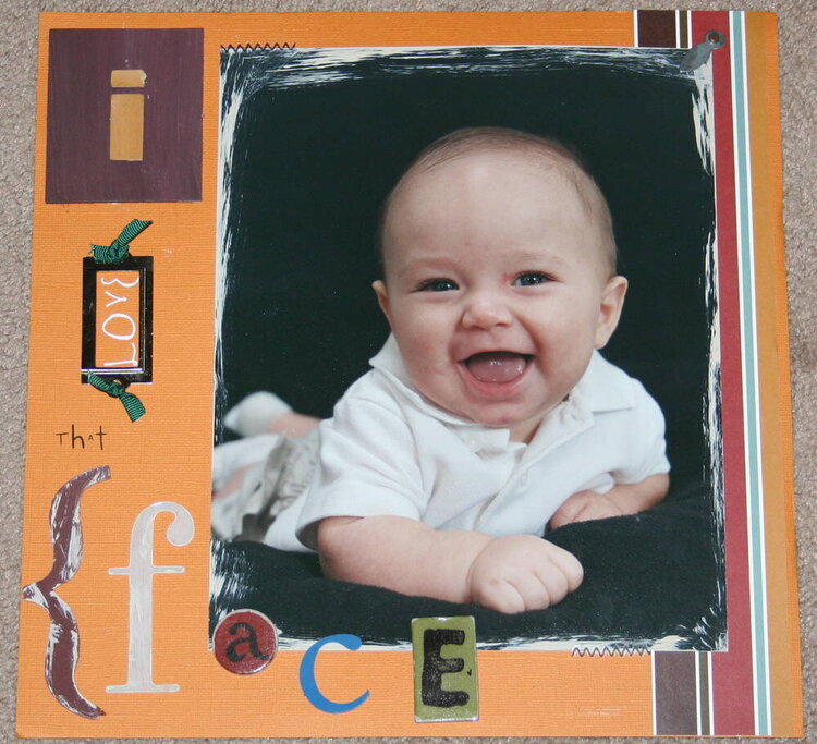
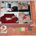
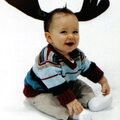
This is a LO of my ds at 5 months old. Not real happy with it, feel it needs something...not sure what. Any suggestions??
No products have been added to this project.

Thanks for spreading positivity!


July 22, 2006
July 22, 2006
July 16, 2006
July 13, 2006
July 13, 2006
July 13, 2006
July 12, 2006
July 12, 2006
July 12, 2006
July 12, 2006
July 11, 2006
July 11, 2006
July 11, 2006