Happy National Scrapbook Day!
Extra 10% OFF Select Scrapbooking Brands with Code: NSD24
Extra 10% OFF Select Scrapbooking Brands with Code: NSD24
Be the first to cheer this project!

 Give a Cheer
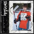
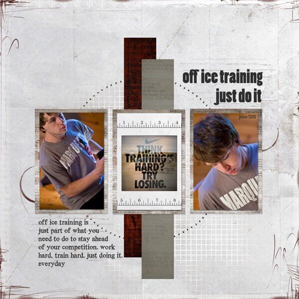
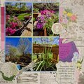
my son is spending his summer doing some off ice training. working hard will keep him on top of his game when he hits the ice again this fall.When I started thinking about my layout and applying design principles, I knew the focus would be on the photos, which really tell my story. The arrangement of the photos, elements, brushes all centered around the circle stitching holes. My photos serve as the anchor of the layout and were evenly distributed around my central element. The paper strips help maintain the visual weight. I kept building my page by adding elements equally. The weight of the title balances with the journaling section because of the point size of the font I chose for each section. When you step back and look at the layout you can see the Horizontal symmetry that I was able to maintain with the design. It is appealing to the eye and draws you into the photos, which as I said, was my main focus of the layout.
No products have been added to this project.


Thanks for spreading positivity!