
Cheers
Give a Cheer

 Give a Cheer
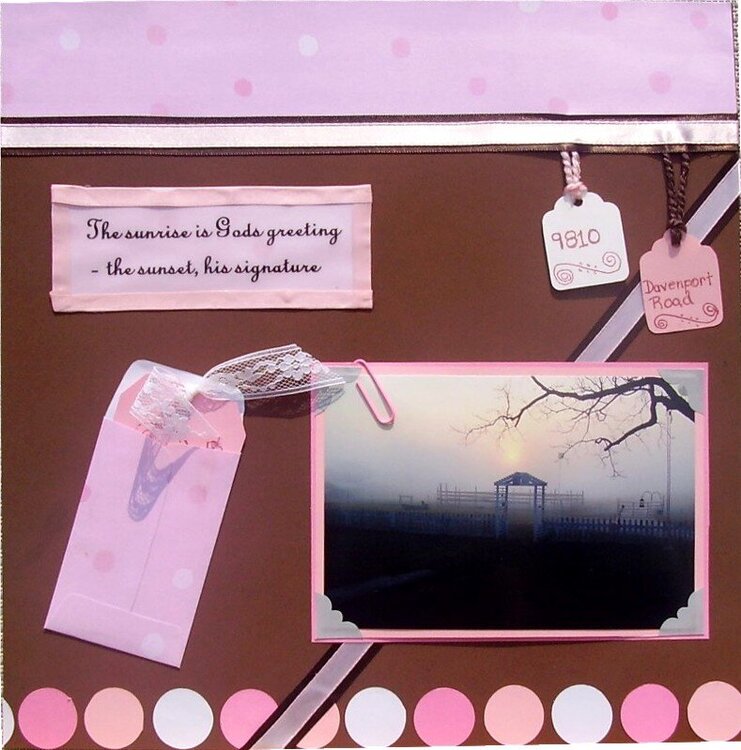
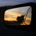
My dh took this picture late March, I just love the way the sun is rising over the pasture...and he included the tree limb and arch.
No products have been added to this project.


Thanks for spreading positivity!


July 23, 2006
July 23, 2006
July 23, 2006
July 22, 2006
July 22, 2006
July 22, 2006
July 22, 2006
July 22, 2006
July 22, 2006
July 22, 2006
July 22, 2006