Livestream Party!
Join us today at 9:00am PT / 12:00pm ET | Details Here.
Join us today at 9:00am PT / 12:00pm ET | Details Here.


Be the first to cheer this project!

 Give a Cheer
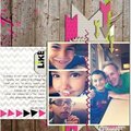
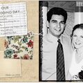
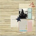
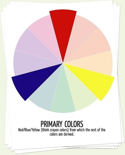
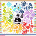
This month, our theme is color combinations. While some people have a natural eye for choosing colors, the use of a color wheel is a great way to simplify the process if it's not a intuitive skill.
The color wheel is based on the primary colors - red, blue and yellow. Each subsequent color is the result of mixing a combination of those three colors. Secondary colors (orange, green, purple) form the second level of the color wheel and the remaining colors represent the intermediate hues between primary and secondary.
When choosing colors for a layout. the general rule of thumb is to choose a dominant color and then use the remainder of the colors more sparingly. It's often referred to as the gallon, quart, ounce rule. Having different proportions of each color keeps the layout interesting and balanced. Mixing your colors with neutrals (white, black, kraft) is a good way to offset the colors as well.
Once you've chosen a color to start with (generally, a color from your photos) then it's time to determine what colors you will use to complement it. There are a few ways to choose your colors from the wheel:
Monochromatic: A monochromatic layout uses shades and tints of a single color. Shades and tints are created by adding white or black to the base color to achieve lighter and darker values of the base hue.
Analogous: An analogous layout uses colors adjacent to each other on the color wheel.
Complementary: A complementary color scheme is created by choosing colors opposite of each other on the color wheel.
Split Complementary: This color scheme utilizes a base color + the two colors adjacent to it's complement.
Triadic: A triadic color scheme is composed of colors spaced equidistant around the color wheel.
Tertiary: Tertiary color schemes use the four colors adjacent to a pair of complementary colors.
No products have been added to this project.


Thanks for spreading positivity!