FREE Standard Shipping on Orders $69+ with code:
FREESHIPPING


Cheers
Be the first to cheer this project!
Give a Cheer
Be the first to cheer this project!

 Give a Cheer
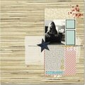
A basic brush already included in your graphics program along with a couple of minor tool adjustments can make quick work of creating a pattern on your next layout.

STEPS:
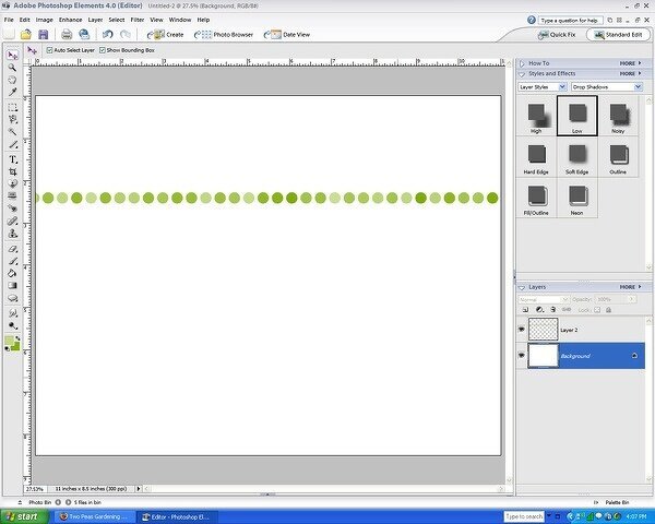
1. Open new document sized to 11" x 8.5"
2. Create a new layer.
2a. Set your foreground and background colors (to start my pattern, I selected a dark and light shade of green.)
2b. Select a hard round brush and set it to approximately 70 px.
2c. Open "More Options" in your brush tool bar and set Spacing to 125% (this setting determines the distance between dots when you use your brush) and Hue Jitter to 100% (this setting determines the variation of color between your fore- and background colors.)
NOTE:
Fade means the number of times the brush image will repeat before fading to nothing (a zero setting means the brush image will not fade.)
Hardness indicates the size of the brushes "hard" center. 100% hardness means the brush will have a hard edge. A 50% hardness means the brush will start to fade to a soft edge 50% from the center of the brush image.
Scatter determines the variation from the center line that the brush strokes will appear. A higher number means more variation while a 0 factor means there will be no variation.
3. Click once on the far left edge of your canvas to start your pattern. Note the position from the top of the page (I started 2.5" from the top of the page) Now, holding the shift key, click of the far right edge at the same position. This will produce a row of dots, each spaced 125% apart from the next, varying in color from dark to light green. (Holding down the shift key maintains the straightness of the line...otherwise, the row of dots will follow the movement of your mouse.)
4. Now, duplicate the layer, position it below your first row of dots, and adjust the hue +20 (Enhance>Adjust Color>Adjust Hue/Saturation). Repeat until you have as many rows as you desire. Continue with the +20 hue adjustment to achieve the subtle color variation from top to bottom. Finally, add photo, embellishments, title and journaling

VARIATIONS:
5. Easy plaid: Select 3 colors. Using a rectangularly shaped brush, set to different pixel sizes and spacing, create a layer using each of the three colors. Merge the 3 layers and set the layer opacity to 50%. Duplicate the layer and rotate 90 degrees to produce a plaid pattern.
6. 30 second stripe: Again, using a rectangular brush, set Spacing to 100% and Hue Jitter to 100%.

CREDITS:
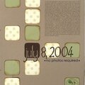
Flourishes: Peapod Kit
Photo Corners: Ben Framed Kit
Date Tag: Juicy Kit
Font: MonoAlphabet
No products have been added to this project.


Thanks for spreading positivity!