FREE Standard Shipping on Orders $69+ with code:
FREESHIPPING


Cheers
Give a Cheer

 Give a Cheer
Boosted Sat a tad
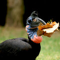
this was with my P&S
No products have been added to this project.


Thanks for spreading positivity!


April 28, 2007
August 13, 2006
August 02, 2006
August 02, 2006
August 02, 2006
August 02, 2006
August 01, 2006
August 01, 2006
August 01, 2006