
Cheers
Give a Cheer

 Give a Cheer
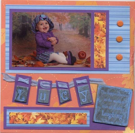
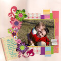
Lulu at 9 months. I love that she's laughing with her whole body. So here's the new LO with your Suggestions, tell me what you think!
No products have been added to this project.
Thanks for spreading positivity!


July 25, 2007
September 11, 2006
September 11, 2006
September 10, 2006
September 10, 2006
September 10, 2006
September 10, 2006
September 08, 2006
September 07, 2006
September 06, 2006
September 06, 2006
August 10, 2006
August 10, 2006
August 10, 2006
August 10, 2006
August 09, 2006
August 09, 2006
August 09, 2006
August 09, 2006
August 09, 2006
August 09, 2006
August 09, 2006