I really like the colors on this with your pictures. I had a similar problem with dark pictures (the U2 layout in my gallery), and I think yours turned out much better! I also really like the white doodling and writing.
Great job! I just love the layout. My friend forwarded this one to me. I also went to one of their concerts here in NB, Canada, they are awesome. Gave me ideas on how to do mine. Thanks :)
This is a really great page!! I really like the word "chicks" too. I think the photos are nice. Maybe you could add some clear rhinestone brads around the pic or up at the top to add a little more sparkle.
This is really neat. I love that you made it match the mood of the pictures. I love the lettering in CHICKS. I love the ribbon at the top and the flower with the d. Awesome job on this!! I feel your frustration about how LOs look IRL and how they look online sometimes, it happens to me too. :)
Nice page. I'll have to foward this one to my friend, since it would give her an idea for her scrapping the Dixies! They came down about 2 weeks ago in New Brunswick Canada. Awesome page!!!
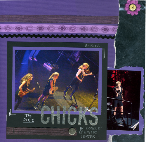
I wanted to do something with my pics from the concert, but they are so dark. I chose a metallic purple mat, and added shiny silver glitter stickers to brighten them up. On the side, I placed metallic silver ripped edging, too. But after the scan - the shiny metallic doesn't really show up like it does when the light hits it, so it still looks dark. I promise you it is a lot brighter in person!!
Does this project or one of it's images contain pornography, profanity, or other illegal or offensive material? If so, please report it and our moderators will come by and clean it up in a flash.
August 24, 2006
August 24, 2006
August 24, 2006
August 23, 2006
August 23, 2006
August 23, 2006
August 23, 2006
August 23, 2006
August 23, 2006
August 23, 2006
August 23, 2006
August 23, 2006
August 23, 2006
August 23, 2006
August 23, 2006