
Cheers
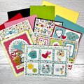
Give a Cheer

 Give a Cheer
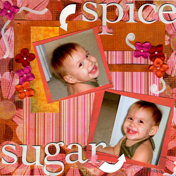
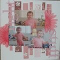
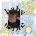
Photo of my daughter. I am not sure if I am like the doodles with the paint. I almost think something is missing. Thanks for looking!
Also thanks to pursejunkie for her help with the design and paper selection!!
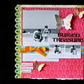
Products used:
Basic Grey paper and fibers
Daisy D's paper (yellow strip)
Heidi Swapp chipboard
MM paint and brads
Prima flowers
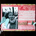
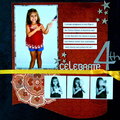
No products have been added to this project.


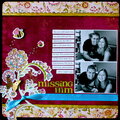
Thanks for spreading positivity!


September 21, 2006
August 31, 2006
August 29, 2006
August 27, 2006
August 26, 2006
August 26, 2006
August 26, 2006
August 26, 2006
August 26, 2006
August 25, 2006
August 25, 2006
August 25, 2006
August 25, 2006
August 25, 2006
August 25, 2006
August 25, 2006
August 25, 2006
August 25, 2006
August 25, 2006
August 25, 2006
August 25, 2006
August 24, 2006
August 24, 2006
August 24, 2006
August 24, 2006
August 24, 2006
August 24, 2006
August 24, 2006
August 23, 2006
August 23, 2006
August 23, 2006