
Happy National Scrapbook Day!
Extra 10% OFF Select Scrapbooking Brands with Code: NSD24
Extra 10% OFF Select Scrapbooking Brands with Code: NSD24

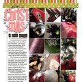
 Give a Cheer
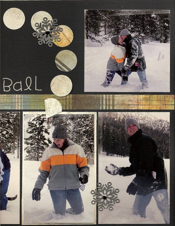
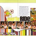
More from our winter escape. I miss the cold winters and I miss the snow. February 2005.
No products have been added to this project.
Thanks for spreading positivity!


June 13, 2008
March 29, 2008
March 08, 2007
October 17, 2006
October 09, 2006
October 08, 2006
October 08, 2006
October 07, 2006
October 07, 2006
October 07, 2006
October 07, 2006
October 07, 2006
October 06, 2006
October 06, 2006
October 06, 2006
October 06, 2006
October 06, 2006
September 21, 2006
September 07, 2006
September 07, 2006
September 05, 2006
September 04, 2006
September 02, 2006
August 30, 2006