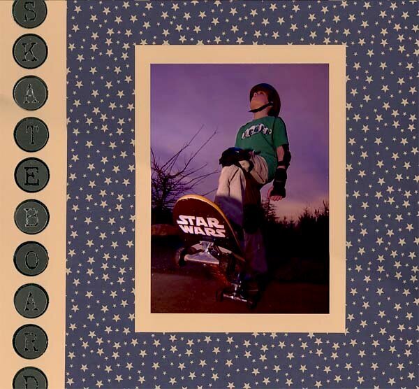
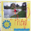
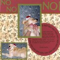
This is a neat layout. I like the simplicity myself. I've never been one to do a whole lot of stuff on a layout except for a couple of times. What a cool picture that is! Great layout!
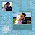
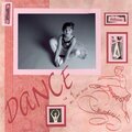
Hey I'm from the forum. In all honesty the page is simple but it's nice. The photo is great. What I think would really make this pop is three accents, placed in a triangle formation around the picture to help bring focus back and ground the photo. I can see how you chose your colors-blue,tan, and the touch of green. Try swapping the amount of color you use. Use the tan as your background, mat your photo with a little of the tan then mat again with the star pattern (off-centering the star pattern mat will give the photo a less static look), for the tan strip on the side use your star pattern instead. To help your charmed title stand out over the star pattern, mat tan circles behind them. I hope I didn't over do it.
Does this project or one of it's images contain pornography, profanity, or other illegal or offensive material? If so, please report it and our moderators will come by and clean it up in a flash.


 Give a Cheer


October 07, 2006
September 16, 2006
September 13, 2006