FREE Standard Shipping on Orders $69+ with code:
FREESHIPPING

Cheers
Be the first to cheer this project!
Give a Cheer
Be the first to cheer this project!

 Give a Cheer
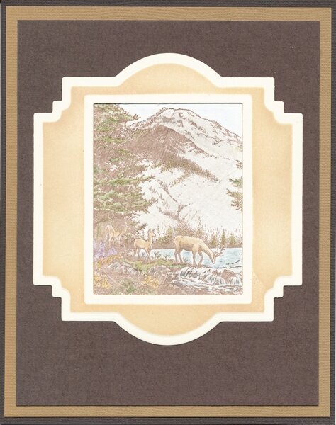
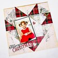
I started this card because I wanted to try making the wonderful frame that Connie made for this card: http://www.twopeasinabucket.com/gallery/member/225259-conniecrafter/1984951-time-to-celebrate/. [twopeasinabucket.com]
I couldn't wrap my head around how Connie had made her window frame even after she Pea-mailed me the directions. She had die cut it using two Spellbinders Nestabilities diesClassic Rectangles and Labels 22. I Googled Labels 22, and they just had the regular embossed edges just like all the other labels. How did she get the cool embossing on hers? I Pea-mailed her again, and she repeated that she had die-cut the frame by putting the rectangle within the label and cutting them together. I still wondered about the embossing, and then I realized that she had die-cut and embossed the two frames together. Would that create that cool window frame look? I decided to just do as she said, and it worked like magic. I was so excited. This opens up all kinds of possibilities for making wonderful frames. Thank you, Connie, for your patience and help.
(ETA, 3/17/14: I added just a little bit more color to the original image.)
THE FRAME:
Spellbinders Nestabilities Labels 22
Spellbinders Nestabilities Classic Rectangles, Small
Unknown Cream Cardstock
Distress Ink, Antique Linen
1. I used the Cuttlebug to die cut and emboss both the dies together by carefully placing the rectangle within the label, blades down, on the cardstock. I used Scotch Removable Tape on two opposite corners to secure them together onto the cardstock.
Tips: Be sure to use some kind of removable tape to keep the dies in place (Scotch Removable Tape, Washi Tape, Eclipse Tape, etc.). Be sure to double-check the placement. This is the voice of experience talking. I had to remake the first piece because it was cut crookedly (no tape). Then I had to remake the second one because, when I was assembling the card, I noticed that the right side of the frame was noticeable wider than the left side.)
2. After die-cutting, I kept the pieces together and embossed them. Magically, that wonderful window-look embossing appeared.
3. I left the dies in place and inked the raised areas with Antique Linen Distress Ink. This makes it harder to see the embossing so be sure to check out Connie's card where you can really see it.
THE CARD:
4 7/8 x 6 1/8
Bazzill Cardstock (card base and tan mat)
Wausau PaperCrinkles Cardstock, 65 lb. (top mat)
Neenah Solar White cardstock (focal image)
PSX Stamp, K2583, Deer Falls (retired)
Palette Burnt Umber Ink pad
Prismacolor Colored Pencils (listed below)
Prismacolor Colorless Blender
The stamp I used is much larger than what you see. I had to select just a portion of it to fit into the frame.
I wanted the image to have the appearance of a tinted photograph or seem the way it might look outside a window in dim light. Now I'm wondering if I should have made it more vivid. You'll be surprised to see all the different colors I used because you can hardly see them at all. I may just have to make another version of this card.
For anyone who is interested and so that I don't forget, the Prismacolor Colored Pencils I used are:
GreensPrussian Green, 109; Kelp, 1090; Green Ochre, 1091
Yellow Ochre, 942
BluesCloud Blue, 1023; Sky Blue Light, 1086; Powder Blue, 1087; Muted Turquoise, 1088
Perma Violet, 1008
Clay Rose, 1017
NeutralsGinger Root, 1084; Warm Grey 20%; French Grey 20% & 30%
TFL.
Daria
No products have been added to this project.

Thanks for spreading positivity!