Storage & Organization up to 60% OFF!
Plus, a FREE Gift! | Details Here.
Plus, a FREE Gift! | Details Here.


Be the first to cheer this project!

 Give a Cheer
On Sunday I attended my second workshop given by Georgia Sommers at Jazzy Crafts in Castro Valley, CA. It was worth driving through torrential rains to get there. (I uploaded the Christmas cards we made at the first workshop to another gallery post.)
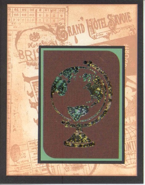
This time I found myself working out of my comfort zone, probably because of the patterned paper which I seldom use even though I love it and the images that weren't in my usual style. That said, I am definitely going to buy the globe stencil (Think cards for bon voyage, graduation, men, etc
), and I grew quite fond of the Lucky Tiki by time I'd finished working with him. He is being retired and was given to all of the participants as a gift.
All cards 4 1/4 x 5 1/2
Dreamweaver stencils
Various Dreamweaver Embossing Pastes
Dreamweaver Metallic F/X (mica powders)
Unknown cardstock and patterned paper (Sorry, we were told, but I forget what it was.)
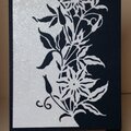
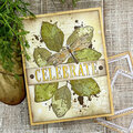
1st cardThe background was made with Distress Ink and Tim Holtz collage stamps. We sprinkled mica powders over wet black glossy embossing paste not letting the brush touch the paste. You have to let that dry before removing the excess mica powder. I didn't wait long enough and ruined my image when rubbing off the powder with a piece of Swifter cloth. I flipped it over and made a new one. The person next to me coached me to use more colors of mica powder, and I like the second version much more than the first one I made. I took it home and let it dry for a long time before using my big, fat, soft brush to remove the excess powder. I like the brush better than the Swifter cloth. This is my favorite card.
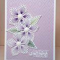
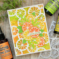
2nd cardI embossed the seahorse with regular white embossing paste and let it dry. Then I applied glue from The Essential Glue Pad with a big dauber through the cleaned stencil. The Palette Glue Pad was also available for use. After removing the stencil again, I applied the mica powder with a brush. It's OK to remove the excess mica powder right after removing the stencil again. I used the Swifter cloth. The background is something I made long ago, maybe for one of Jennifer's Thinking Inking classes. I'll have to check because I don't remember how I made it. It shimmers. Even though it doesn't match the focal image, it still looked better than anything else I tried. I added Swarovski flatback crystals, SS16, Pacific Opal (a perfect match to the background) trying to tie the focal image to the background.
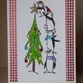
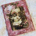
3rd cardGeorgia had already embossed the Lucky Tiki image with glossy green paste on patterned paper; she wanted the image to be completely dry before we added the Crackle Paste in class. Did you know that you need to add Crackle Paste over matte or glossy paste? We set that aside to dry while we went on to other projects. It was fun to see the crackling begin as the paste dried. When it was dry, we put the cleaned stencil back on the image and stenciled it (colored it) with stipple brushes and Color Box Fluid Chalk Inks. Pigment inks were also provided. I had a really hard time finishing this card. I tried it with many different combinations of cardstock. I liked this simple set-up best. I inked the hemp with Vintage Photo Distress Ink and let it dry overnight. The button was from my stash.
4th cardSuper easy! Matte black embossing powder on patterned paper. Georgia provided the card and matching envelope. Some people used mica powder on their masks, and they looked cool; but I wanted to keep this one very simple because of the pp.
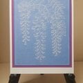
5th cardGeorgia had embossed this with matte black paste before class. I added glue and mica powders in the same way we did on the seahorse card. The patterned papers were two-sided. I chose the darker side for the matting. Georgia also gave us Sizzix cut-outs, a scalloped edge that I didn't use, and dimensional foam adhesive I forgot to use.
This was an informative and fun class. Georgia encouraged us to try out different pastes with different types of paper and cardstock. I didn't have time to do that, but I'll be following her advice here at home. One lady had the most beautiful seahorse; it looked like abalone shell. I think she had started out with glossy white paste. The man next to her had a wonderful, dramatic turtle; he had used darker colors with purples predominating. Wonderful effect.
TFL. Daria
No products have been added to this project.
Thanks for spreading positivity!