FREE Standard Shipping on Orders $69+ with code:
FREESHIPPING

Cheers
Be the first to cheer this project!
Give a Cheer
Be the first to cheer this project!

 Give a Cheer
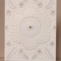
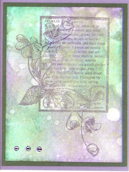
4 1/4x 5 1/2
StampAspects of Design
Distress InksPine Needles & Dusty Concord
Perfect PearlsGreen Patina
CardstockBazzill
Embossing PowederRanger Supefine Clear
Swarovski flatback crystalsSS16, Tanzanite
I re-watched all of Jennifer McGuire's Thinking Inking, Week 1 classes on Distress Inks. I wanted to repeat an ATC-sized background I'd made. I used the same ingredients, but they don't look alike at all.
I applied Distress Inks with the application tool and used a brush to splatter some water on it to make the splotches. I used a small paint brush to flick the Perfect Pearls over the ink and spritzed it to set the Perfect Pearls. I ended up dipping a stipple brush in a bit of water and using that to stipple over the Perfect Pearls. Then I had to iron it dry.
I inked the stamp with Dusty Concord and heat embossed with clear EP. IRL the image doesn't show up very well. Next time I make a background like this, I'll use my old faithful, VersaFine Onxy Black ink.
Thank you for this challenge. I've been wanting to try out the distress ink backgrounds again. They are lovely.
Note: The colors in the background are not as bright as they appear here. Also, you can't see the shimmer that the Perfect Pearls add.
TFL. Daria
No products have been added to this project.


Thanks for spreading positivity!