
Happy National Scrapbook Day!
Extra 10% OFF Select Scrapbooking Brands with Code: NSD24
Extra 10% OFF Select Scrapbooking Brands with Code: NSD24

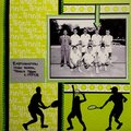
 Give a Cheer
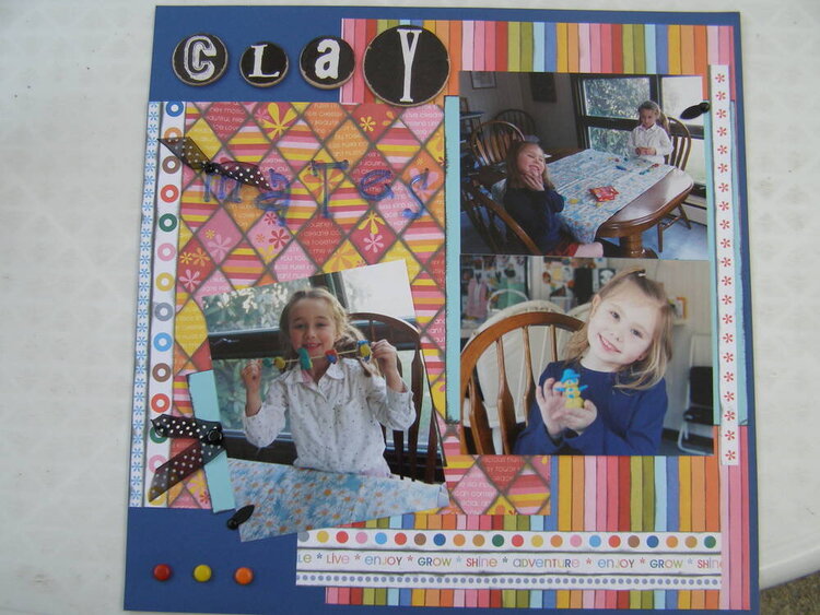
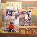
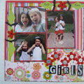
My dd and her friend creating with clay. The word mates is acrylic letters and reads much better in person. The journaling is hidden behind the single picture on the left and is attached to the black ribbon and pulls out.
No products have been added to this project.
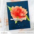
Thanks for spreading positivity!


October 23, 2006
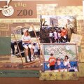
September 07, 2006
September 07, 2006
September 07, 2006