
Cheers
Give a Cheer

 Give a Cheer
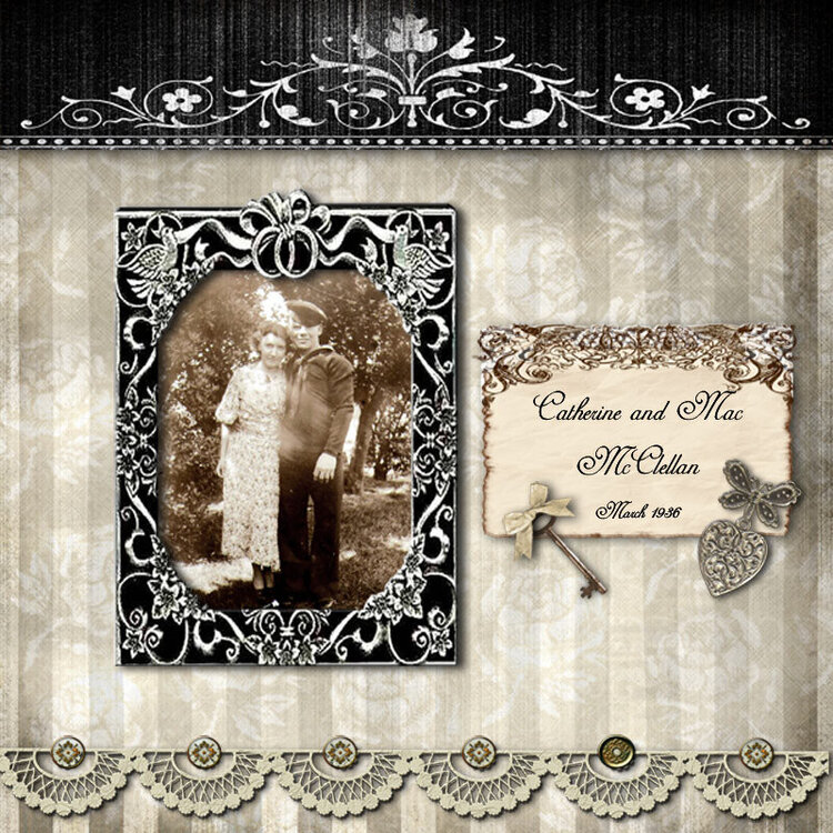
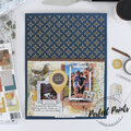
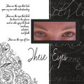
In looking at this layout, I decided to use the original sepia version of the photo instead of the black and white I originally posted. I did tone the sepia down a bit - I like it much better.
No products have been added to this project.

Thanks for spreading positivity!


November 29, 2014
November 29, 2014
November 29, 2014
February 08, 2010
November 06, 2006
September 19, 2006
September 17, 2006
September 17, 2006