

FREE Standard Shipping on Orders $69+ with code:
FREESHIPPING


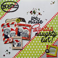
 Give a Cheer
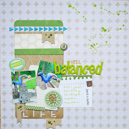
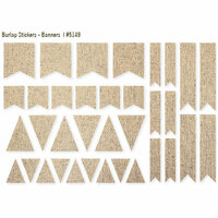
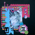
I used papers from Teresa Collins, Heidi Swapp, Jillibean Soup, Fancy Pants packaging, Simple Stories envelope, washi sticker, burlap banners, sticker word and tag, American Crafts thickers, Lily Bee sticker letters, Doodlebug pearls, MME brad, Heidi Swapp enamel triangles, Bella Blvd sticker word bubble, Chic Tags wood veneer, Pink Paislee tag


Thanks for spreading positivity!


September 29, 2014
August 30, 2014
August 30, 2014
August 30, 2014
August 29, 2014
August 21, 2014
August 20, 2014
August 13, 2014
August 13, 2014
August 10, 2014
August 10, 2014
August 09, 2014
August 09, 2014
August 08, 2014
August 07, 2014
August 07, 2014
August 07, 2014
August 07, 2014
August 07, 2014
August 07, 2014
August 07, 2014
August 07, 2014
August 06, 2014