Thank YOU! It's Customer Appreciation Week!
EXTRA 11% OFF Orders $100+ With Code: THANKYOU
EXTRA 11% OFF Orders $100+ With Code: THANKYOU

 Give a Cheer
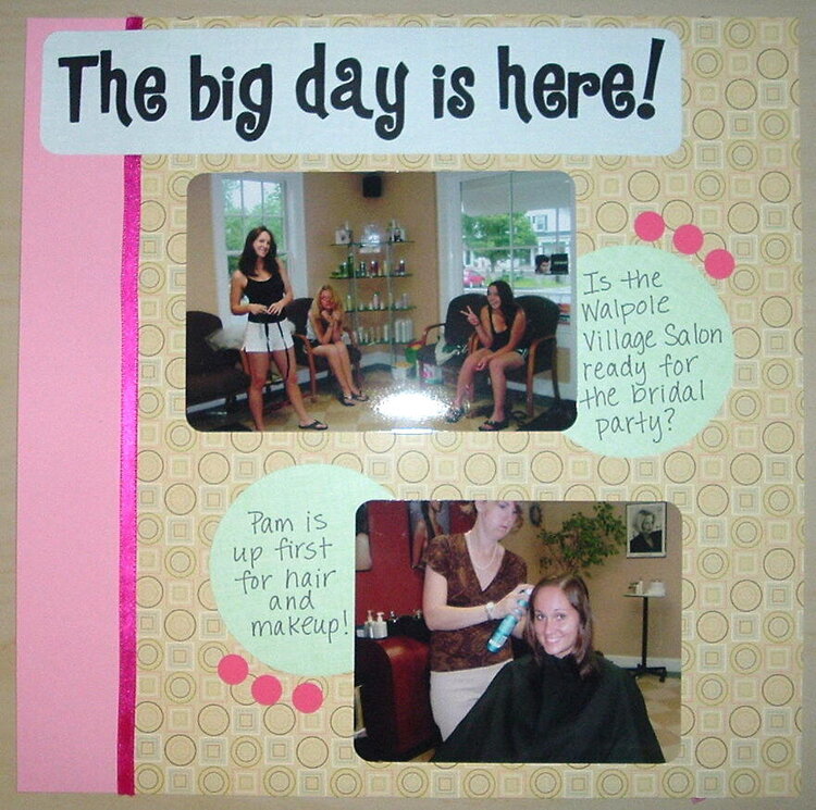
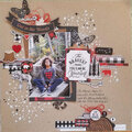
This is the first page in the hair section. I wanted to do something with circles in the album. (This salon was right down the street from my sister's house. It was not very cool. One girl actually redid her hair back at the house.) Chatterbox PP in the background.
No products have been added to this project.

Thanks for spreading positivity!


October 28, 2006
September 21, 2006
September 20, 2006
September 20, 2006
September 20, 2006
September 20, 2006
September 20, 2006
September 19, 2006