Storage & Organization up to 60% OFF!
Plus, a FREE Gift! | Details Here.
Plus, a FREE Gift! | Details Here.


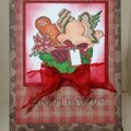
 Give a Cheer
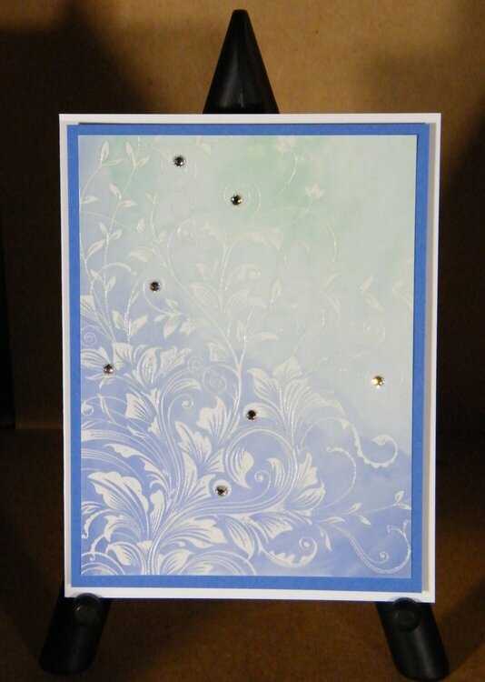
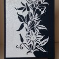
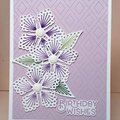
I made these cards for Heidis Color Theory Challenge: Analogous Colors, http://duhnproductions.com/forum/index.php?topic=520.0. I totally CASED her beautiful card (http://www.duhnproductions.com/Pics/displayimage.php?album=52&pid=916#top_display_media). Thank you, Heidi. Ive had this stamp for a long time, and this is the first time Ive used it.
I used the Versamark Resist Technique. I was experimenting with LaBlance Thick Specialty Stamping Paper, cardstock which Tim Holtz said is the same as Rangers Specialty Cardstock. I didnt like it for the watercolors. They were absorbed too quickly to blend them, leaving very distinctive marks (covered up by the bows). It worked great with the Distress Inks.
CARDS:
4 ¼ x 5 ½
Neenah Classic Crest Solar White Cardstock (card base)
SU Cardstock (single-matted cards)
Bazzill Cardstock (double-matted cards)
LaBlanche Thick Specialty Stamping Paper (focal image)
FOCAL IMAGE:
Hero Arts Leafy Vines, CG509
Versamark Ink
Ranger Clear Superfine EP
Peerless Watercolors -- Dk. Green, Dk. Blue (single-matted cards)
Distress Inks Salty Ocean, Broken China, Mowed Lawn; I added Faded Jeans to the Salty Ocean on one of the cards. (double-matted cards)
Swarovski Rhinestones, Crystal, SS12
Rangers Matte Accents (to adhere the crystals)
Ribbon (unknown, a RAK from NoraThank you Nora!)
Fun Foam (used to mount the focal image on the cards with rhinestones)
TFL.
Daria
No products have been added to this project.

Thanks for spreading positivity!


June 23, 2020
February 03, 2015
February 03, 2015
February 03, 2015
February 03, 2015
February 03, 2015
January 30, 2015
January 30, 2015