


FREE Standard Shipping on Orders $69+ with code:
FREESHIPPING


 Give a Cheer
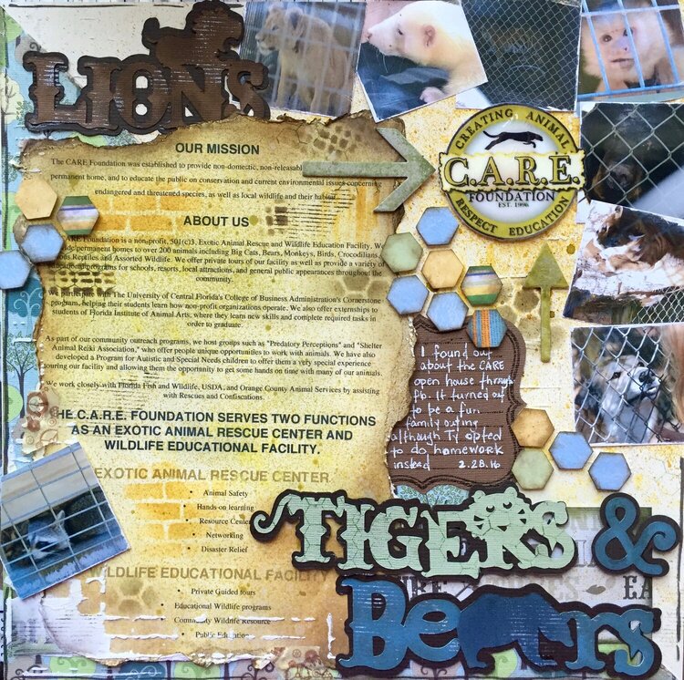
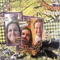
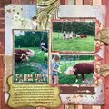
Great organization that cares for animals. They only open to the puclic once a year. for the anything goes challenge to scrap what we did this weekend


Thanks for spreading positivity!


June 27, 2016
March 22, 2016
March 08, 2016
March 05, 2016
March 03, 2016
March 03, 2016
March 03, 2016
March 01, 2016
March 01, 2016
March 01, 2016
March 01, 2016
March 01, 2016
March 01, 2016
March 01, 2016
March 01, 2016
March 01, 2016
March 01, 2016
February 29, 2016
February 29, 2016
February 29, 2016
February 29, 2016
February 29, 2016
February 29, 2016
February 29, 2016
February 29, 2016
February 29, 2016
February 29, 2016
February 29, 2016
February 29, 2016
February 29, 2016
February 29, 2016
February 29, 2016
February 29, 2016
February 29, 2016
February 29, 2016
February 29, 2016