Thank YOU! It's Customer Appreciation Week!
EXTRA 11% OFF Orders $100+ With Code: THANKYOU
EXTRA 11% OFF Orders $100+ With Code: THANKYOU

 Give a Cheer
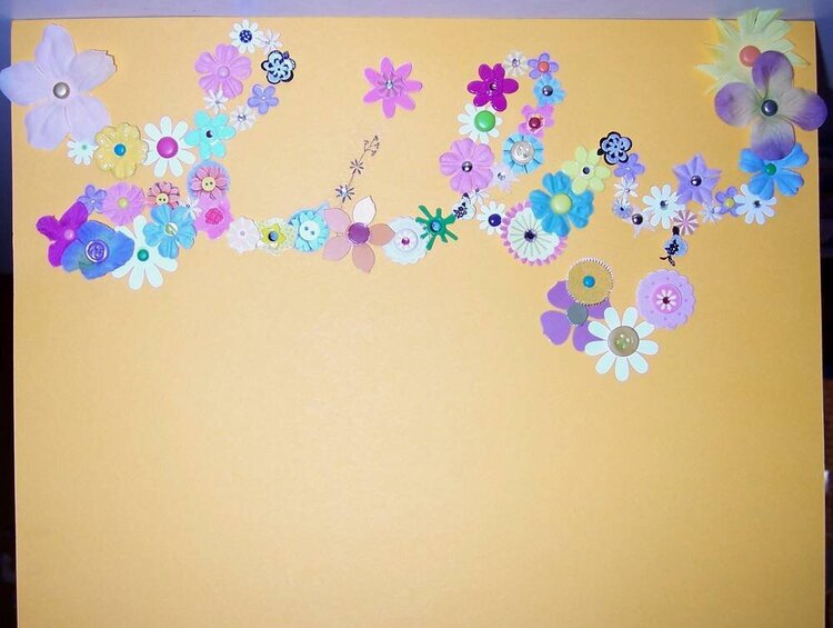
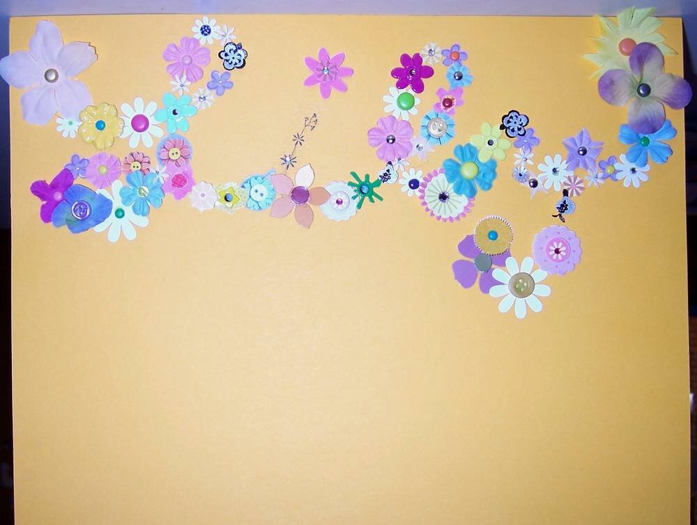
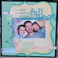
So, I came up with this idea for a great title for a layout about my daughter, Lily. I wrote her name in script and covered it with flowers. The problem is, it is really difficult to read. My ideas for solving the problem are not great, but here's what I was thinking:
1. I could outline the script with dots in black markers of different thicknesses.I'm afraid this will make it look too busy.
2. I could outline it in a single black line, like a doodle, but I think it might make it look sloppy.
3. I could cut it out from the yellow cardstock, leaving a border and adhere it to a black or dark colored cardstock, but again, sloppiness concerns me.
4. I could leave it as is and hope that people can read it, since the journaling will explain it.
Any and all criticism, advice, help would be appreciated.
Thanks.
No products have been added to this project.


Thanks for spreading positivity!


October 28, 2006
October 28, 2006
October 28, 2006
October 28, 2006