Stamps, Inks, & Stamping Accessories on SALE!
Take 9% OFF orders $100 or more with code: SPRING
Take 9% OFF orders $100 or more with code: SPRING

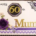
 Give a Cheer
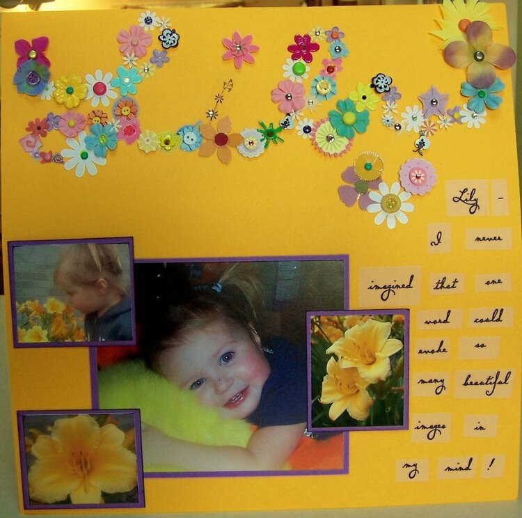
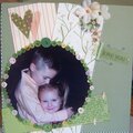
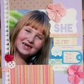
Journaling reads: Lily - I never imagined that one word could evoke so many beautiful images in my mind.
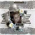
OK...I am totally HATING this layout! I had a picture in my mind of how I thought it would turn out and it is just not right. I fixed the flowers on the "L" so it looks more like a cursive "L." But now, I feel like it's missing some patterned paper or something, underneath the title.
I like how the journaling squares turned out. I really like the font I used.
I think I like the pics....It's just not balanced or too much white space or something.
H...E...L...P!
No products have been added to this project.

Thanks for spreading positivity!


October 30, 2006
October 29, 2006
October 29, 2006
October 28, 2006
October 28, 2006
October 28, 2006