Cool pix. I agree with the rest. The names on the left side is a bit "lonely". I would overlap it on the photos itself. And move the strip of photos to the left to create visual interest.
I like the strip of photos. In my opinion, I would move them a little left or a little right instead of having them right down the middle. It might add a little visual interest. I agree with eliminating the name strips. Have you tried writing the names directly on the pictures? I find this useful (and cute), when there are a lot of people in the picture and you want future generations to know who they are. Great start!
Love how you used the deco scissors to make the photo mat. JMHO, but I would mat each picture individually and do away with the name strips. See comments on other page. Great start!
Lovely patterned paper, especially with the deco cut. The names look a bit lonely off to the side, I would put them closer to the photos, but that's just me.
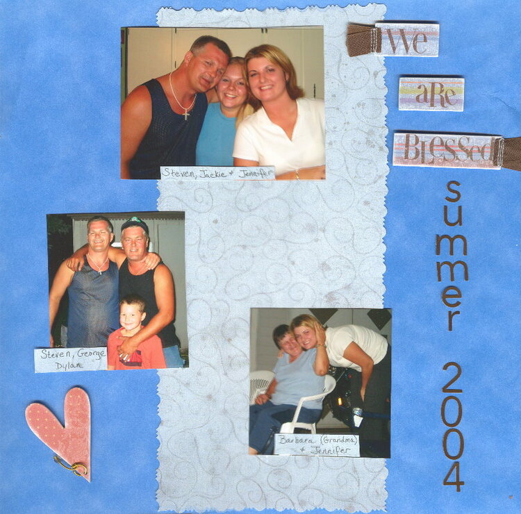
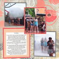
After many appreciated suggestions, I repositioned this page, I like it a lot better. I'm not sure if I'm fully satisfied with it but I do consider it improved. Any more suggestions? This was summer 2004 and a get together of my DH's lovely nutty family. As you can probably tell, I like 2 page LO's
Does this project or one of it's images contain pornography, profanity, or other illegal or offensive material? If so, please report it and our moderators will come by and clean it up in a flash.
November 13, 2006
November 09, 2006
October 30, 2006
October 29, 2006
October 28, 2006
October 28, 2006
October 28, 2006