

Storage & Organization up to 60% OFF!
Plus, a FREE Gift! | Details Here.
Plus, a FREE Gift! | Details Here.


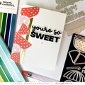
 Give a Cheer
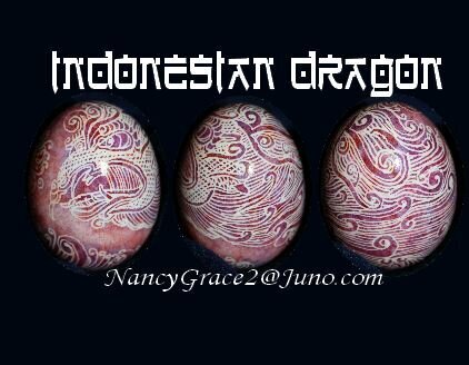
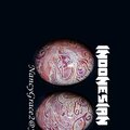
HIROSH was the runner-up of the several different fonts I played around with. It had to be
DIFFERENT
LEGIBLE
FITTING.
(Not that it fit, although that is always a consideration, but that the image of the words would suit the project, with its Indonesian origins.)
HIROSH looks a little more oriental that KLINGON BLADE, but I felt it was not quite as legible,
Just a small distinction, but my artistic eye makes fine distinctions.
I then experimented with both finalists for the fonts on my contact info.

Thanks for spreading positivity!


September 08, 2016